As digital technology advances, it is becoming increasingly important to expedite everyone’s access to websites, apps, and other digital products. Web accessibility is a key factor in creating a successful web project. It not only provides an essential service for those with disabilities but also opens up the online presence to a much wider user base.
Let’s explore the importance of web accessibility, why it should be a priority for every web project, how web accessibility can make websites more accessible and inclusive to all, and how accessibility has a positive impact on user experience.
What Makes a Website Accessible?
Accessible websites are designed with features that allow users with disabilities to access the content more easily and efficiently, which includes using ARIA attributes, semantic HTML elements, and color contrast ratios that meet the standards of accessibility guidelines.
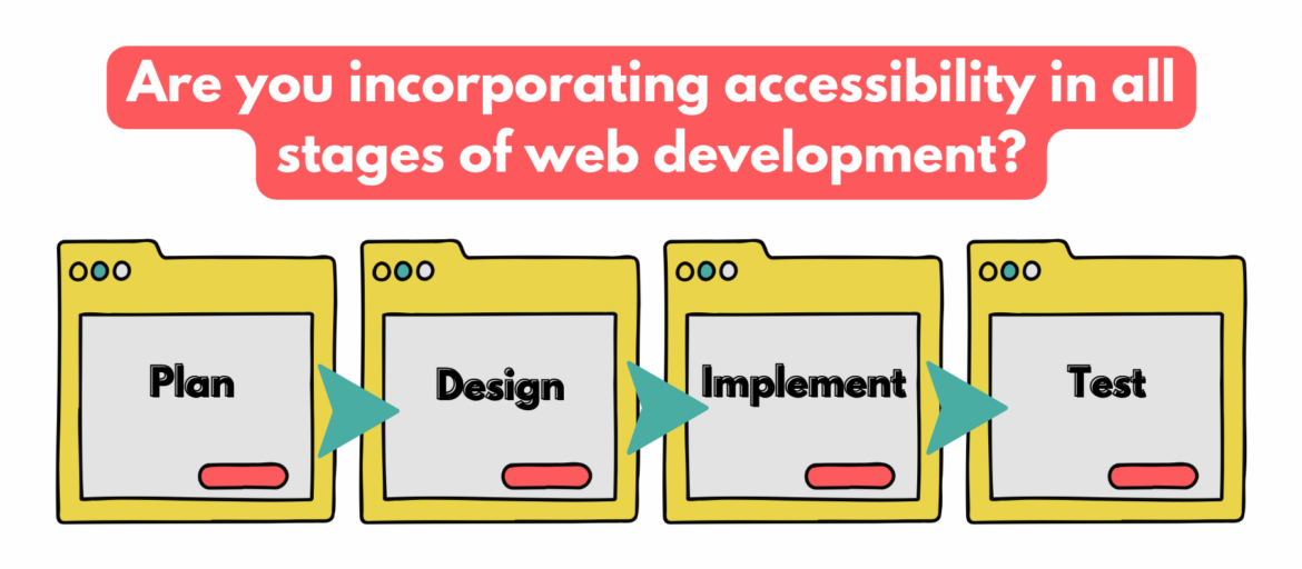
The challenge with web accessibility is to integrate it into every phase of the web development process, from design to deployment. This means making sure that user experience (UX) meets the needs of all users, including those with visual impairments, hearing impairments, physical disabilities, cognitive disabilities, and more.
When designing, developing, and deploying a website, think about how users with disabilities will interact with the site. Take the time to plan out a website’s accessibility early in the process by incorporating the following features. Doing so will save time down the line in testing for compliance.
Planning Phase
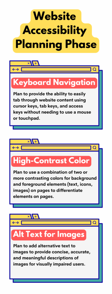
Keyboard Navigation
With keyboard navigation, users can easily tab through the content on a website without needing to use a mouse or touchpad. This allows them to quickly and efficiently move around the page as required. For example, keyboard navigation allows cursor keys to move around the page, tab keys to navigate between links and fields, and access keys for shortcuts to specific parts of a site.
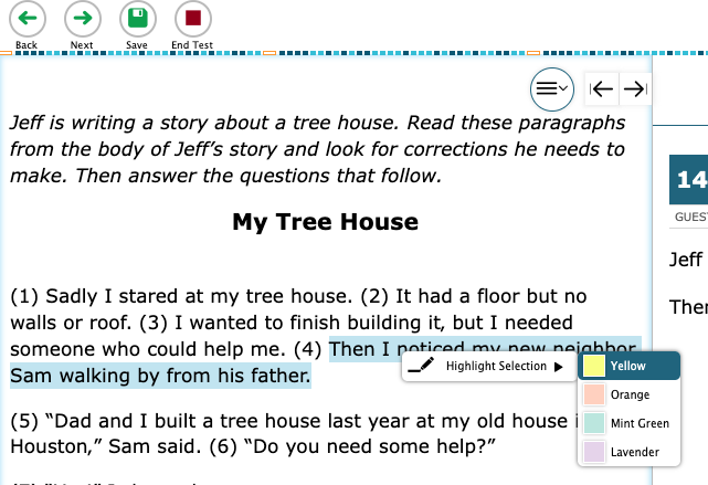
High-Contrast Colors
High-contrast colors, a combination of two or more contrasting hues, and highlight important information, making it easier for users to find what they are looking for. High-contrast colors can be used for background and foreground elements, including text, icons, and images, to differentiate between elements on the page and facilitate access to the content. When using high-contrast colors, choose the right color combinations that are both aesthetically pleasing and legible so that users can navigate a website without any trouble.
Alternative Text (alt text) for Images
Alternative text allows visually impaired users to understand the image and its context. It also helps search engine robots understand and index the content of a page more easily. When writing alt text, describe the content of an image using simple terms. Write concisely, accurately, and in a meaningful manner to someone who cannot see the image. It should also be short enough that it does not distract everyone else from the overall experience.
Design Phase
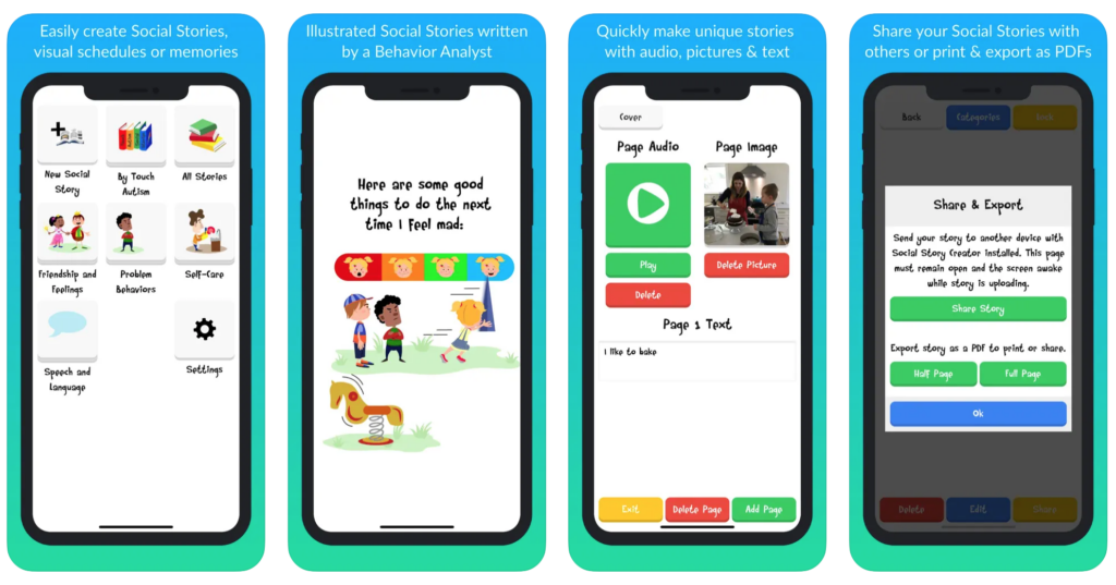
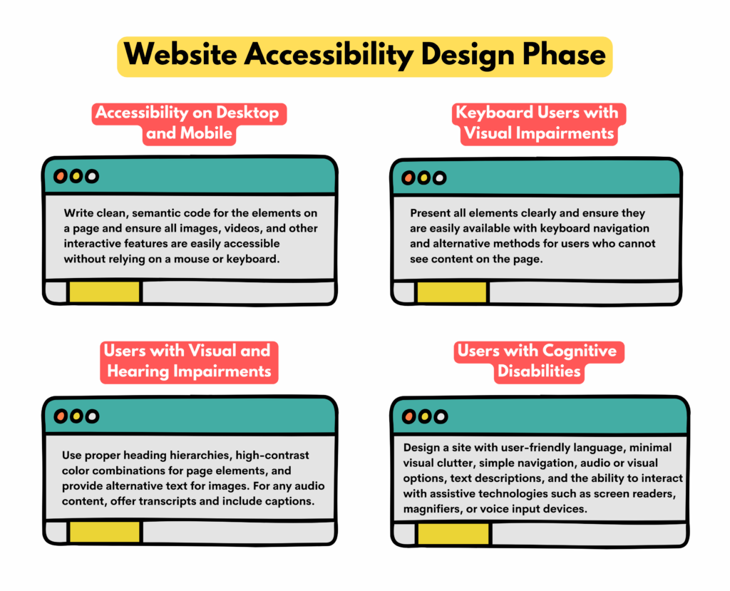
Accessibility on desktop and mobile
Designing web accessibility for desktop and mobile browsers requires special attention to establish that all parts of the website are accessible and usable on both devices. That means considering keyboard navigation, screen reader compatibility, color contrast, font size, etc. It involves writing clean, semantic code for the elements on a page and ensuring all images, videos, and other interactive features are easily accessible without relying on a mouse or keyboard.
Keyboard users with visual impairments
Designing a website with keyboard users in mind means that all page elements are clearly presented and easily available with keyboard navigation. It also provides alternative methods for users who cannot see the content on the page, such as those who have difficulty using a mouse or cannot see certain colors.
Users with visual and hearing impairments
Designing a website accessible for the visually and hearing impaired makes all the difference in providing an enjoyable experience for those who may not have access to all of the standard website features. This includes providing images with alternative text, proper heading hierarchies, and high-contrast color combinations. In addition, developers should also offer audio transcripts for videos and include captions for audio content to provide users with a convenient user experience.
Users with cognitive disabilities
These users may need help understanding complex visual layouts or comprehending large amounts of text. Therefore, ensure the design is simple, intuitive, and easy to use. This involves using user-friendly language, minimal visual clutter, simple navigation, clear visual cues and prompts, and audio or visual options and text descriptions. In addition, ensure users can interact with a website with assistive technologies such as screen readers, magnifiers, or voice input devices.
Implementation Phase
During the implementation phase, designing user interfaces that are accessible and compliant with W3C (World Wide Web Consortium) and WCAG (Web Content Accessibility Guidelines) is essential. This involves ensuring that a website’s content meets accessibility standards, such as providing alternative text for images, adding captions to videos, and providing transcripts of audio recordings.
For example, developers must consider how users with visual impairments will access content on the website by providing text alternatives to images or other multimedia elements. Ultimately, adhering to these standards during the implementation phase will help to create an equitable online experience for all users.
Test Phase
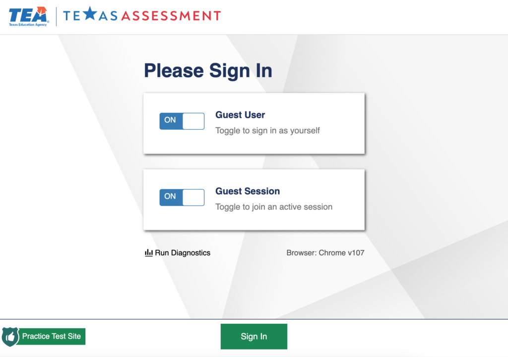
Web accessibility testing is an integral component of the web development process to confirm that a website meets current accessibility standards such as ADA (Americans with Disabilities Act) and WCAG. It also ensures that the site creates an inclusive digital experience for all users.
During this phase, developers check the accessibility status of their website to identify any user-experience issues and verify that the site is easy to use regardless of any disability.
Furthermore, the team should conduct usability tests with disabled people to get feedback on how they interact with the site to identify any remaining issues that can be addressed before launch. Checkpoints include checking for color contrast, keyboard navigation, and other features to make the website more accessible for people with different needs.
Finally, run accessibility tests using online tools like checkers or web browser extensions that provide a free accessibility audit. However, such tests should also be conducted regularly throughout the development process to identify and resolve potential issues before launch.
Web accessibility provides a level playing field for people with disabilities, allowing them to take advantage of opportunities available on the internet. Ultimately, all stakeholders should strive to make the web a place where everyone has equal access to resources and information. By following best practices in web accessibility, businesses can create a user-friendly, inclusive website that is accessible to everyone with ease.

