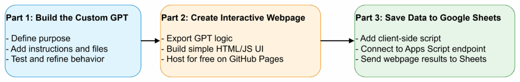
In the two previous parts of this blog series, you saw how to make a custom GPT accessible to anyone, whether they have a ChatGPT account or not, as a website. In part one of the AI Magic Maker series, you created a custom GPT-based Fun Personality Quiz. In part two, you saw how to turn a custom GPT into a webpage for easy access via the web. In part three, you will learn how to simply vibe code to collect the data entered via the web version of Fun Quiz into a Google Sheet.
In this part, we’ll explore how to save data from the interactive webpage to Google Sheets for later analysis. Saving the data from the interactive webpage to Google Sheets takes this interactive page to a whole new vibe code level since you can now create quizzes and more that save the data.
Wait, How Is This Possible?
The journey from custom GPT requiring individual user accounts to a webpage anyone can access is made possible through the use of free tools. Those tools include:
A GitHub account. How to get a free account is explained in part two of the series.
A Google Drive account with Google Sheets. You can do this with the free, or consumer, version of Google Sheets or you can use your Google Workspace for Education/NonProfit account.
Google Apps Script Web App. This is such a game-changer and I suspect you may soon be making your own Web App scripts using Generative AI. It’s the “hidden” lesson in this series.
All these tools are free. Of course, I did rely on a paid Gen AI model (about $20 a month).
Achieving the Impossible
Using Gen AI (for part three, I asked my Claude Pro account for help), I asked for a step by step. Since I’m not a Google Apps script whiz and failed BASIC programming in high school (I hope you appreciate how tough an admission like that would be for a high school student), I can attest to the power of vibe coding to help me achieve this hitherto impossible task.
Yes, with Gen AI at your side, you can leap tall mountains of code. But you first must have a plan.
The Plan
The plan is that you will create a Google Sheet and deploy a Google Apps Script as a Web App (takes approximately five minutes). Then, Gen AI will update the script.js to POST (a specific action, so that’s why it’s capitalized) the result to the Web App URL.
The data logged per quiz submission will be:
Timestamp
Quiz name (e.g., “Smurfs”)
Result character (e.g., “Papa Smurf”)
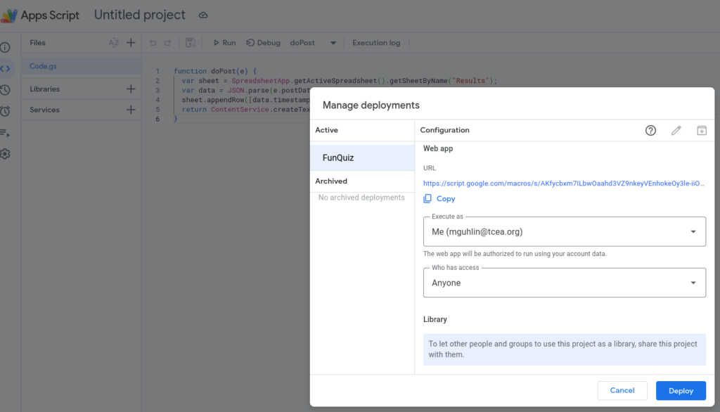
Step 1: Set up Google Sheets + Apps Script
These are the steps I will follow in the video available to you at the end of this blog post. In the meantime, follow these steps:
Create a new Google Sheet.
Name the first sheet tab Results.
Add headers in row 1: Timestamp, Quiz, Character.
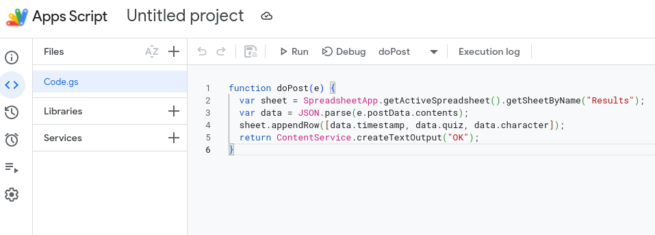
Go to Extensions → Apps Script.
Replace all code with this:
function doPost(e) { var sheet = SpreadsheetApp.getActiveSpreadsheet().getSheetByName("Results"); var data = JSON.parse(e.postData.contents); sheet.appendRow([data.timestamp, data.quiz, data.character]); return ContentService.createTextOutput("OK"); }
Click Deploy → New deployment
Type: Web app
Execute as: Me
Who has access: Anyone
Copy the Web App URL. You will need it next.
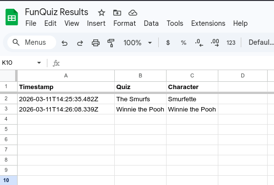
Step 2 — Updated script.js
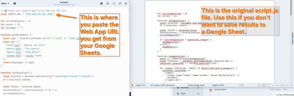
Now that you are ready with the Google Sheets Web App URL, you will need to add it to the script.js file at the top of the file. This will result in rows like the ones in this Google Sheet:
This is the only file you need to replace. All four HTML files already load script.js, so nothing else changes. Once you have your Apps Script Web App URL, replace “YOUR_WEB_APP_URL_HERE” at the top of the file.
Each completed quiz will log a row like:
Timestamp
Quiz
Character
2026-03-11T14:32:00Z
The Smurfs
Papa Smurf
That’s pretty much all there is to it. Not sure what to do?
Watch the Video
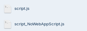
This video walkthrough will get you started. You are also going to get the download file (a compressed zip file linked below the video) with all the web pages and the generic script.js so that you won’t be tempted to simply use mine.
In this video, you get a tour of the process, from start to finish:
You can also download a copy of the entire FunQuiz website from GitHub using the link below:
Remember, if you decide to try this yourself, you will need to update the script.js file to point to YOUR Web App URL, rather than mine.
Since you have both versions of the file, you can compare them:
From left to right: Script.js file that saves results to Google Sheets, script_NoWebAppScript.js that simply runs the quiz and no results are saved. Make sure to rename the “script_NoWebAppScript.js” to “script.js” if that’s what you decide to use.
Wrapping Up
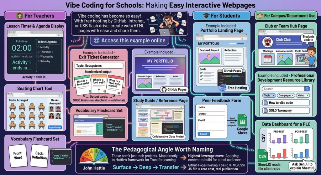
Vibe coding has become so easy, and with free hosting by GitHub or any web server you have access to, you should be able to create web/HTML pages with ease and share them. Here are some potential applications in school environments, even though it may drive technology directors crazy with the need to host teacher-generated HTML pages (but it’s super inexpensive, so why not on an intranet server or off a USB flash drive?).
Here are practical, high-impact ideas organized by who benefits most.
A simple, bare bones example of one of each of the following ideas is available. It took about thirty seconds to make, and that shows. I could have spent more time on it, but this example should give you an idea of what’s possible with minimal time investment.
🧑🏫 For Teachers
Lesson Timer and Agenda Display. A full-screen HTML page showing the day’s agenda with a countdown timer per activity. No app needed, just a browser tab.
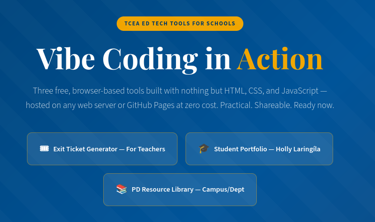
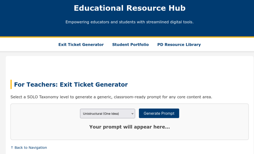
Exit Ticket Generator (example included). Input a topic, get a randomized exit ticket question. Teachers could build a bank of prompts tied to SOLO levels (unistructural → relational questions).
Seating Chart Tool. Drag-and-drop HTML interface for arranging desks. Exportable as an image. Far lighter than any app.
Vocabulary Flashcard Set. A simple spaced-repetition card flipper built around a unit’s word list. Teacher edits one JSON file to update the deck.
🎓 For Students
Portfolio Landing Page (example included). Students build a personal HTML page showcasing work samples, reflections, and goals. Hosted free on GitHub Pages. Real-world skill, real audience.
Study Guide/Reference Page. A single-page interactive reference sheet for a unit — definitions, diagrams, examples — that students help build as a class project.
Peer Feedback Form. A lightweight HTML form that structures feedback using a protocol (e.g., “I notice/I wonder/What if”). Submissions could go to a Google Sheet via a free form endpoint.
🏫 For Campus/Department Use
Club or Team Hub Page. A simple landing page for a club: meeting times, announcements, photo gallery. Students own and update it.
Professional Development Resource Library(example included). A searchable, filterable page of links, one-pagers, and videos organized by topic. Way faster to update than a LMS page.
Data Dashboard for a PLC. A static HTML page that visualizes pre/post assessment data from a CSV. No backend needed if you use a SheetJS that will read the file client-side. (No, I don’t know what SheetJS is either, but ask Gen AI to explain it to you).
For example, Dr. Aida Guhlincozzi runs a Geosciences camp in Missouri (wouldn’t this be great to have in Texas?). Here are some sample projects that camp participants (all students) could create:
1. Interactive Disaster Response Map. Students place SVG/CSS pins on a campus or regional map, tag each with resource type (water, food, shelter), and add pop-up notes explaining why that location matters. Demonstrates spatial reasoning and GPS concepts.
2. “Before & After” Disaster Slider. A CSS clip-path slider showing satellite imagery or hand-drawn maps before and after a natural disaster. Students write captions explaining the geoscience behind the change.
3. Personal Field Journal. A scrollable, styled “expedition log” with sections for hypothesis, observation, data collected, and reflection. Could include a hand-drawn map image upload area. Demonstrates scientific writing and process documentation.
4. Mini-Data Dashboard. Students input their own GPS coordinates from a field activity into a table that auto-calculates the distance between points. Demonstrates data literacy and real-world math application.
5. “Meet a Geoscientist” Profile Card. A styled bio card students build about a scientist they researched; includes a quote, field of study badge, and “why this matters” section. Great for identity/representation work (ties directly to Guhlincozzi’s story).
6. Decision Tree: What Would You Do?. A branching HTML page presenting a disaster scenario. Each choice leads to a new page/section with consequence text. Students author the branches, not just navigate them.
The Pedagogical Angle Worth Naming
These aren’t just tech projects. Each student item maps directly to Transfer learning in Hattie’s framework. Students applying content knowledge to build something real for a real audience is one of the highest-leverage moves in the Surface → Deep → Transfer progression.
GitHub Pages hosting + a basic HTML/CSS/JS file = zero cost, real publication. Oh, the places we’d go!
Code Reject
Google Gemini 3 Pro coded this page below. It’s amazing, but not quite as good as the Claude Pro generated version included above. Still, for comparison’s sake, it’s worth including below:
Every year, I gather all the fabulous Google resources from our blog. This year, we have had some amazing posts on topics ranging from AI-Powered Google AI tools to Google experiments. Check out this fantastic list of Google blog posts from this past year categorized by topic/tool.
AI
An AI-Powered Google Workspace – We all know that Google Workspace is amazing. But have you seen AI-powered Google with all of its new features and updates?
Seven Google Experiments to Explore – Discover seven fun and unique google experiments that are sure to have you leveling up skills of all kinds, from typography to culinary.
Streamline Workflow with Google Forms – Check out the benefits of using Google Forms for school security checks, counseling referrals, and special program referrals!
Communication is the cornerstone of any successful school. It fosters collaboration between teachers, keeps parents engaged, and ensures students feel informed and supported. Yet, navigating the complex web of communication needs within a school community can feel like a constant uphill battle. This is where technology steps in, offering a powerful trifecta to streamline data sharing and revolutionize communication across all stakeholders: Autocrat, Google Sheets, and Looker Studio. Let’s delve into how each tool can empower your school to achieve smoother and more effective communication.
Google Sheets: Organize Your School’s Data
Think of Google Sheets as the central nervous system of your communication strategy. This user-friendly spreadsheet tool offers a collaborative platform for collecting, organizing, and managing all your school’s data in one place.
Here’s how Google Sheets can transform communication:
Consolidated Data Source: Say goodbye to scattered information! Google Sheets allows you to create a central repository for student data, attendance records, grades, and parent contact details. This ensures everyone has access to the same accurate and up-to-date information.
Real-Time Collaboration: Multiple teachers or staff members can work on the same spreadsheet simultaneously, fostering better collaboration and ensuring everyone stays on the same page.
Data Analysis Made Easy: Google Sheets offers built-in data analysis tools, allowing you to identify trends or patterns in student performance or parent engagement. This valuable information can then be used to inform communication strategies.
But what if you could amplify the power of Google Sheets and leverage it for better communication?
Autocrat: Automate Tasks and Save Time
Imagine a world where repetitive administrative tasks are handled automatically, freeing up valuable time for educators to focus on what matters most – their students. Autocrat, a potential game-changer in this scenario, is a tool that automates communication workflows.
What is Autocrat?
Autocrat is a Chrome extension that seamlessly integrates with Google Sheets. It automates repetitive tasks within your spreadsheets, freeing up valuable time for educators. Imagine sending personalized birthday greetings to every student in your class or automatically generating report cards. Autocrat can handle these tasks, and more, all based on the data you have in Google Sheets.
Here are some ways Autocrat can benefit your school:
Automate Newsletters and Reports: Autocrat can automate the creation and distribution of routine reports like attendance updates, lunch menus, or upcoming events, ensuring everyone receives timely information. Here is a tutorial from Matt Miller’s Ditch That Textbook blog on how to create a newsletter and use Autocrat to send it:
Personalize Communication: It can personalize communication by automatically merging pre-written templates with relevant data from Google Sheets, saving teachers the hassle of repetitive tasks. Imagine sending birthday greetings, certificates, or personalized progress reports to students effortlessly.
Streamline Grading and Feedback: Autocrat can potentially automate the process of sending out grades or feedback. Make a Google Sheets Gradebook, create a grade report template in Google Docs, and use Autocrat to merge and send. This can significantly reduce teacher workload and improve communication with parents.
But what if there was a tool that made reporting and analysing this type of data easy?
Looker Studio: Transform Data into Meaningful Visualizations
Data is powerful, but raw numbers on a spreadsheet can be overwhelming. Looker Studio bridges this gap by transforming data from Google Sheets into clear, visually appealing dashboards and reports. Connect it to Google Sheets and send visual data reports with Autocrat!
What is Looker Studio?
Looker Studio (formerly known as Data Studio) is a free data visualization tool by Google. It connects to your Google Sheets and transforms raw data into interactive dashboards and reports. Looker Studio allows you to present complex information in an easily understandable way, making it ideal for communicating with parents and administrators. Here is a one-minute intro:
Here’s how Looker Studio empowers communication:
Easy-to-Understand Reports: Looker Studio allows you to create interactive dashboards that present complex data in a user-friendly format. Imagine presenting student progress reports to parents with clear charts and graphs, making it easier for them to understand their child’s performance.
Targeted Communication: Tailor reports to specific audiences. Create custom dashboards for teachers to track student progress or generate reports for administrators to visualize school-wide trends. This ensures everyone receives the information most relevant to them.
Data-Driven Decision Making: Looker Studio empowers data-driven decision making. By visualizing trends in areas like attendance or student performance, schools can identify areas for improvement and tailor communication strategies accordingly.
The Benefits
Imagine a Looker Studio dashboard for parents that displays their child’s progress in various subjects using clear charts and graphs. This dashboard would be directly linked to the student’s data in Google Sheets, and Autocrat could be used to schedule automatic updates to the dashboard throughout the semester. This creates a single source of truth for parents, allowing them to easily track their child’s performance.
The true magic lies in how these three tools work together. Google Sheets provides a central data hub, Looker Studio transforms data into clear communication, and Autocrat automates tasks. This integrated approach offers a multitude of benefits:
Reduced workload for teachers and staff.
Improved transparency and communication with parents.
Enhanced student engagement through personalized communication.
Data-driven decision making for school improvement.
Increased efficiency and streamlined communication workflows.
The Communication Trifecta
The magic truly happens when these three tools work together. Here’s a breakdown of the integration:
Autocrat automates tasks: It uses data within your Google Sheets to populate reports, personalize communication, and streamline workflows.
Google Sheets acts as the central hub: It stores all your school’s data in one place, ensuring everyone has access to the same information. Autocrat interacts with this data to perform its automation magic.
Looker Studio visualizes the data: It takes the information from Google Sheets and transforms it into clear and compelling reports and dashboards, perfect for communicating with parents and administrators.
By embracing technology and leveraging the power of Autocrat, Google Sheets, and Looker Studio, schools can bridge the communication gap and foster a more informed, engaged, and successful school community. Remember, effective communication is a journey, not a destination. Take the first step today and empower your school community to thrive.
Every year, I gather all the fabulous Google resources from our TechNotes blog and put them all in one place for you. This year, we’ve had some amazing posts on everything from Google’s new AI tools to Google experiments. Check out this incredible list of Google articles from 2023 categorized by topic/tool.
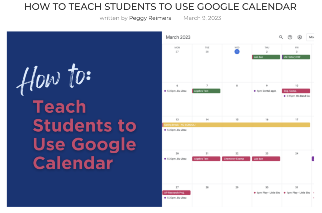
How to Teach Students to Use Google Calendar: Want to help your students get more organized? Teach them to use Google Calendar to keep track of personal and school events, tasks, and more!
10 Google Experiments to Explore (August 2023): Let AI guess what you’re drawing, blow bubbles with people in Italy, make music with words, and more! Which Google Experiments will you try?
Sheets
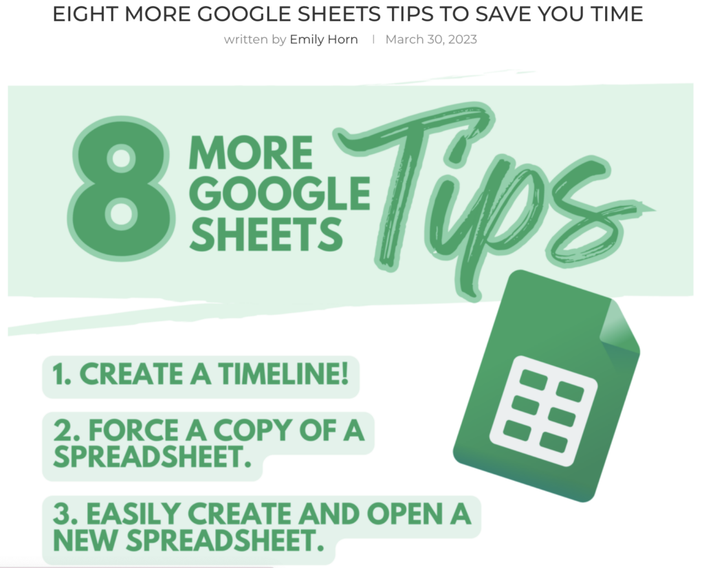
Eight More Google Sheets Tips to Save You Time: Learn how to create a detailed timeline, translate languages, easily automate tasks, and more – with eight amazing Google Sheets tricks!
Digital Spring Cleaning Made Simple: Need to clean, protect, and back up your digital files? Learn some tips and tools for digital spring cleaning. Get started now!
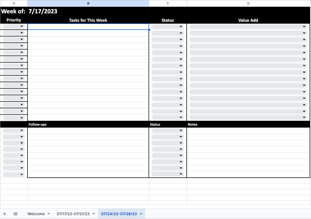
When you are juggling many projects, staying focused and on task can sometimes be challenging. Having an effective to-do list will help you prioritize tasks and focus on getting critical ones done while not letting the small but still necessary to-do items fall through the cracks. Originally, I was a Post-it note or index card to-do lister. No matter what day it was, I had at least one Post-it note to help keep me on track. But I found that system works as long as you don’t need to track more than what you are doing today. Using a Post-it note or index card can help in a pinch, but this system can’t help you identify trends on how you’re spending your time. Having an effective system can be a lifesaver when reviewing what has been keeping you busy. It can also be a life support when looking ahead and what items you need to tackle that are coming down the pike. This is where a task tracker comes in handy.
What Is a Task Tracker?
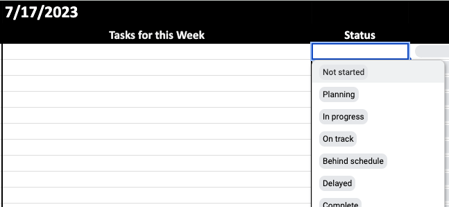
For our purposes, a task tracker is a spreadsheet used to keep us focused on a weekly basis. The spreadsheet has four columns: Priority, Task for This Week, Status, and Value Add. Each week, we duplicate the base sheet and fill it in with the items to be completed.
For each item, we identify the level of Priority for one column:
Priority Levels
Urgent and Important [UI]
Important but not Urgent [InU]
Urgent but not Important [UnI]
Not Important and not Urgent [nInU]
For sorting and filtering, it’s easier to have these as numbers 1 through 4. Having identified the level of priority will help you decide which tasks get your most productive hours of the day and/or most immediate energy.
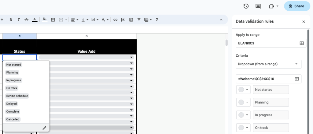
In the spreadsheet, there is also a column for Status. This column can vary with how you fill it in, but it should include Completed, Delayed, In Progress, Canceled, and other signifiers as you feel they apply. Of course, one column will be the Tasks for This Week with a description or name for each task. And the last column will identify the Value Add. The value add is where you identify why you are doing something. How does doing this item benefit your company or employer? This column will be very different based on your particular role and job duties.
How to Use the Task Tracker Spreadsheet
You can use this template, and when you click, the link will ask you to make a copy to your Google Drive. Once copied to your drive, you will want to edit the spreadsheet to meet your needs. You can edit drop-down menus by changing the validation rules for each cell with a dropdown. Those rules will pop up when you click the arrow for the drop-down menu in a cell and click the Edit icon (pencil) at the end of the drop-down menu.
Now that you have your task tracker spreadsheet set up, don’t add tasks to the Blank sheet. Keep it for reference. Instead, do the following:
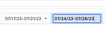
Duplicate the Blank sheet (right-click and select Duplicate) and name it the dates for that week.
(OPTIONAL) Hide the Blank sheet by right-clicking on the tab and selecting Hide Sheet.
During the week, add items to your spreadsheet and track them.
Set the priority of each task as you add tasks.
Set the value add of each task as you add tasks.
Continue adding tasks to the sheet (inserting rows as needed) and updating the status when needed.
As needed, sort the spreadsheet by the Priority column or Status column.
Below the portion for tracking tasks, use the section for follow-ups and notes to note any follow-up phone calls, conversations, or emails you need to make or any updates or questions you have.
At the end of a week, duplicate the current week’s tab and rename it with dates for the upcoming week.
Leave items from the current week in the new week’s tab if they need to stay on your radar or if they are incomplete.
“Nerdify” Your Task Tracker Sheet
As if you aren’t nerdy enough by keeping your to-do list in a spreadsheet, consider using conditional formatting to color the cell based on the content of the dropdown box. For my task tracker spreadsheet, I have the row to turn green if the status is set to “Complete”. If the status is “In progress”, then the row is yellow. Otherwise, the row is red.
Instead of setting the conditional formatting based on the status, you could use the priority as the trigger for coloring the rows. If you are new to conditional formatting, then check out one of these previous posts to get more help:
If you use the task tracker, how will you tweak it to make it fit your own style and processes? Will you do conditional formatting? What other features will you add to it to make it more user-friendly? Drop a comment below and let us know.
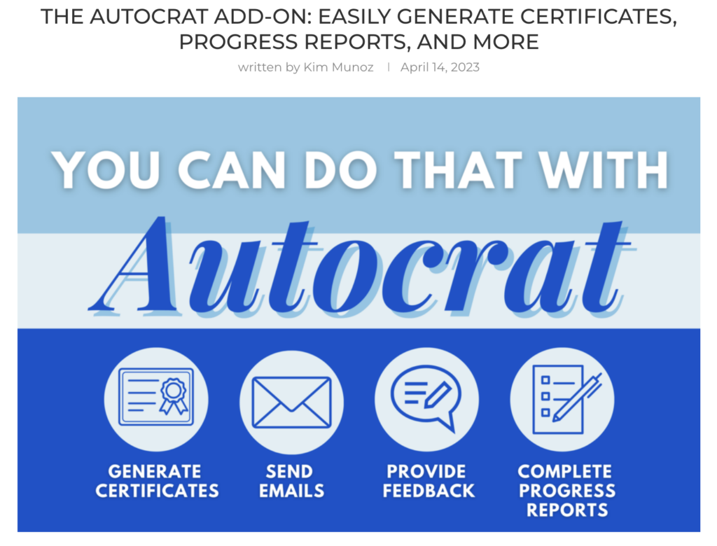
Are you tired of spending countless hours on repetitive tasks? Tasks that can be both time-consuming and monotonous? Fortunately, there is a tool that can help streamline these processes: Autocrat! Let’s take a look at this tool and a few ways it can be used.
What is Autocrat?
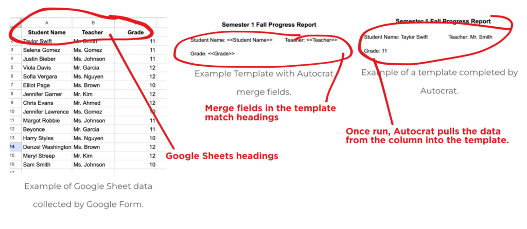
Autocrat is a magical, multi-purpose document merge tool. It’s a Google add-on that allows you to take data collected on a spreadsheet and merge it into a template created in Google Docs or GoogleSlides. Tell Autocrat which fields to populate via <<merge tags>> and then watch as Autocrat automatically generates personalized documents. If you’re not sure what all this means, keep reading, and I’ll show you how it’s done. But first, let’s look at four ways to use Autocrat as an educator.
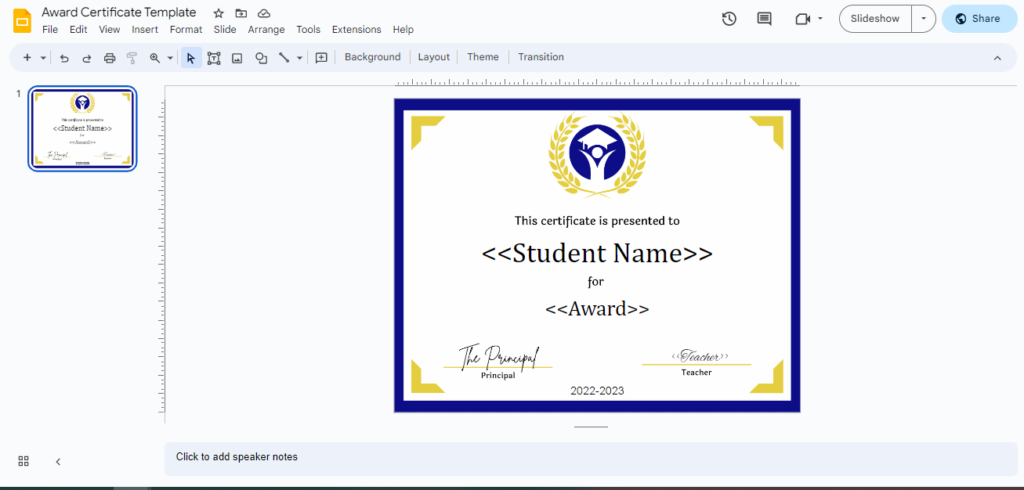
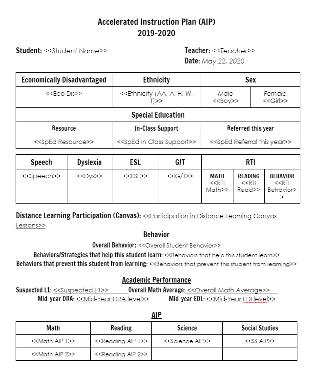
Generate Personalized Certificates
Example Student Award Template for Autocrat
One of the most time-consuming tasks for teachers and school staff is generating certificates for students. This can be for anything from academic achievements to participation in extracurricular activities. Autocrat can help streamline this process by automatically generating personalized certificates. Instead of manually creating certificates for each individual, Autocrat can merge data from a Google Sheet into a Google Doc or Slide template and create a unique certificate for each recipient. This process can save hours of time and allows for a more personalized touch, making the recipients feel valued and appreciated, but also ensures accuracy and consistency across all certificates.
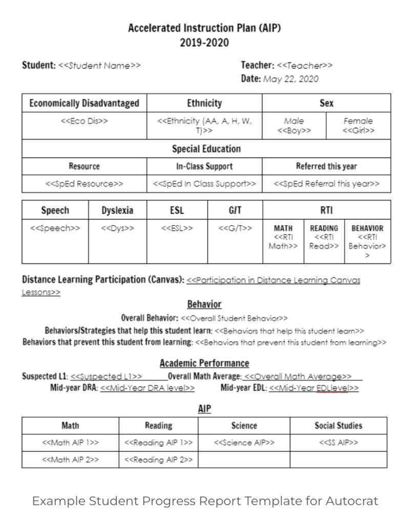
Create Student Progress Reports
Example Student Progress Report Template for Autocrat
As an educator, keeping track of student progress is crucial for ensuring that students are meeting learning objectives and achieving academic success. However, creating progress reports for multiple students can be a daunting task. With Autocrat, progress reports can be automatically generated by merging data from a Google Sheet into a pre-designed Google Doc or Slide template. This not only saves time but also ensures consistency across all reports and provides teachers with a clear overview of each student’s progress, making it easier to identify areas that require additional support or attention.
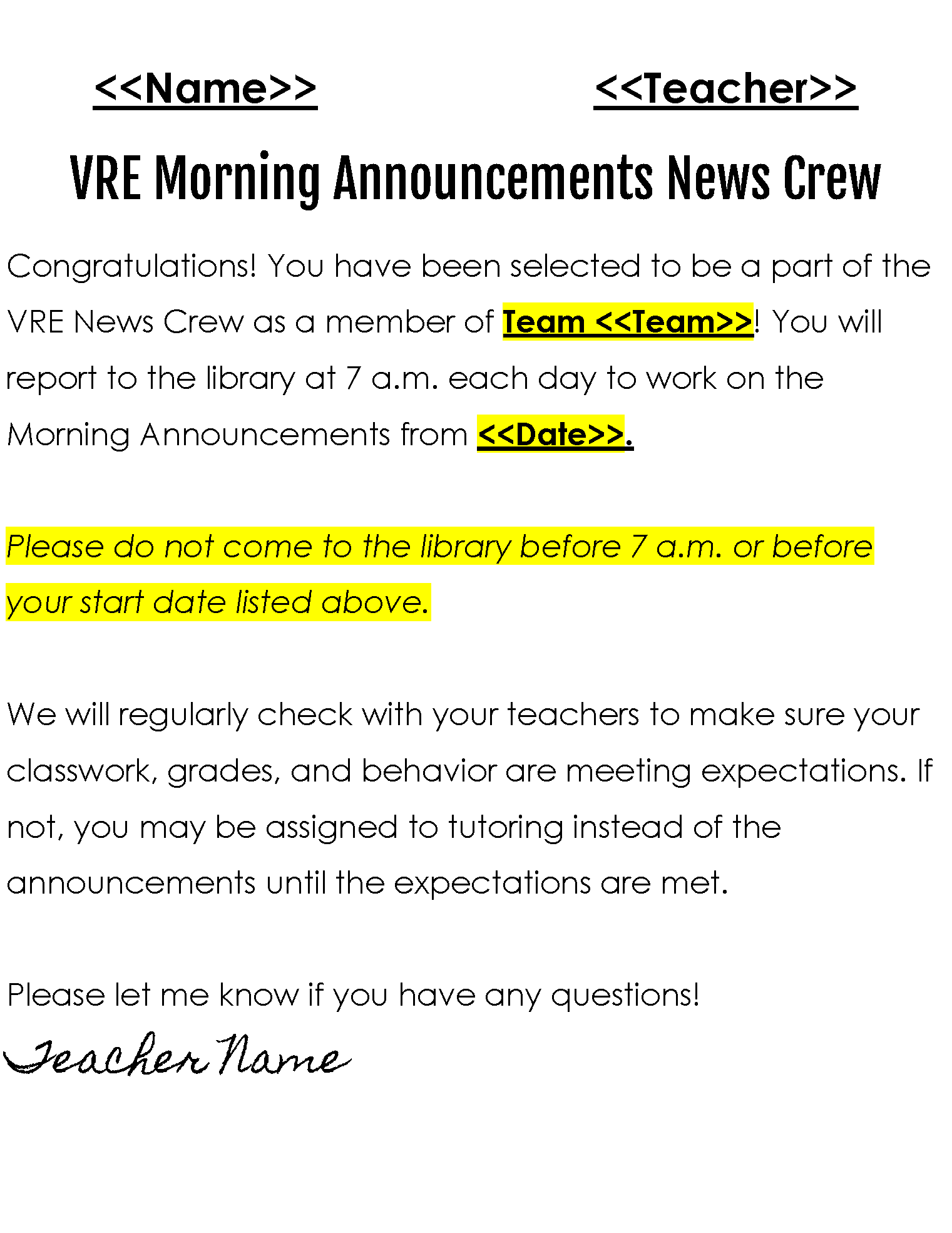
Streamline Feedback for Students and Staff
Providing feedback is an essential part of the teaching process, but it can also be time-consuming. Autocrat can help streamline this process by automatically generating personalized feedback for each student or staff member based on data collected on a Google Sheet or in a Google Form. By setting up a template in Google Docs or Slides and merging data from the Google Sheet, teachers or administrators can easily provide personalized feedback for each student or staff member. This not only saves time but also ensures that feedback is consistent and tailored to each individual’s needs.
Automate Email Communication
Example Email Template for Autocrat
Communicating with students, staff, and parents is an essential responsibility of school staff. Autocrat can be used to automate the distribution of email communication to students, staff, and parents. Communicating important information to multiple recipients can be a time-consuming task with lots of copy-pasting. By using Autocrat, email communication can be automatically generated by merging data from a Google Sheet into a pre-designed email template. This process not only saves time but also ensures that all recipients receive consistent and accurate information.
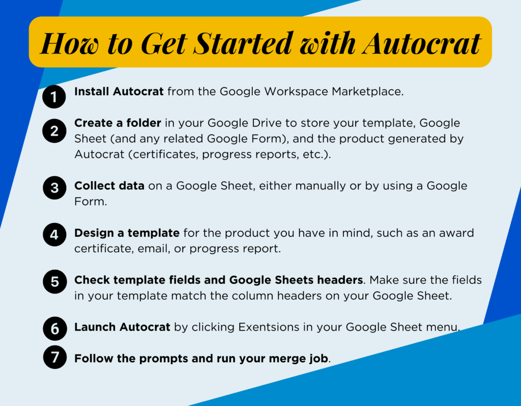
How to Get Started with Autocrat
So how do you begin? First, you will need to get a few things ready.
2. Create a folder in your Google Drive to store your template, Google Sheet (and any related Google Form), and the product generated by Autocrat (certificates, progress reports, etc.).
3. Collect data on a Google Sheet, either manually or by using a Google Form.
4. Design a template for the product you have in mind, such as an award certificate, email, or progress report.
5.Check template fields and Google Sheets headers. Make sure the fields in your template match the column headers on your Google Sheet. For example, if your Google Sheet column for final math grades is titled “Mathematics,” you will need your template to say <<Mathematics>> in the spot you’d like Autocrat to fill that grade.
6. Launch Autocrat by clicking Exentsions in your Google Sheet menu.
7.Follow the prompts and run your merge job.
As you can see, Autocrat is a powerful tool that can enhance the efficiency of repetitive and time-consuming tasks. From generating personalized certificates to automating email communication, Autocrat can save you countless hours of work and improve the overall effectiveness of your workflow. So, are you ready to make some magic? Give Autocrat a try and take back control of your time!
You Can Do That with Autocrat! Stop manually pulling data from Sheets to create documents- automate instead! Using AutoCrat, you can set up automation to create the documents you need in a fraction of the time!
Stop Paying for That! (co-presenting with Krista Keiser) Paying for resources out of your own pocket? It’s time to keep your money! Canva Educators have access to tons of free resources to keep your content beautiful and engaging.
It’s the end of March. That means it’s time for more time-saving tips for Google Sheets. Why? Because any time is a good time for Google Sheets tips! Right? Here are eight more tricks to try. Hopefully, you’ll learn something new that can help you on the daily. Enjoy!
1. Create a Timeline
Did you know that you (and students!) can create timelines using Google Sheets? These can be used for history, project management, collaborative tasks, and more. Check out this quick three-minute video showing how to take Civil War battle information to create a timeline of the Civil War.
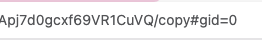
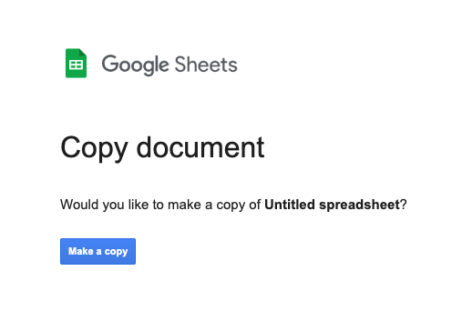
2. Force a Copy of a Spreadsheet
Want to let people use your spreadsheet as an editable template without giving them access to your actual spreadsheet? Change the word “edit” in the URL to “copy”, and share this link.
They’ll be prompted to make a copy of your spreadsheet for editing!
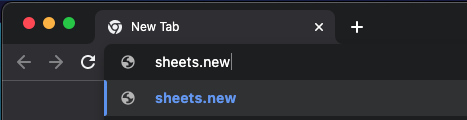
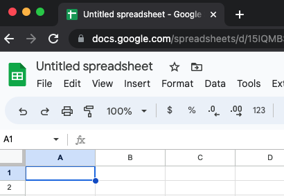
3. Easily Create and Open a New Spreadsheet
If you’re looking for a fast and easy way to create a brand new spreadsheet, look no further. Simply go to the search bar and type “sheets.new.”
Your new spreadsheet will magically appear!
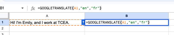
4. Translate Languages within a Sheet
You can translate the contents of one cell into another language using this formula:
=GOOGLETRANSLATE(cell with text, “source language”, “target language”)
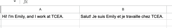
Simply place the formula in the cell you want the translated text to appear, indicate the cell you’d like translated, and use the two-letter language code for the source language and the target language. In the example below, I place the formula in B1. I asked it to translate text from A1 from English (en) to French (fr).
Et voila! You have your translation.
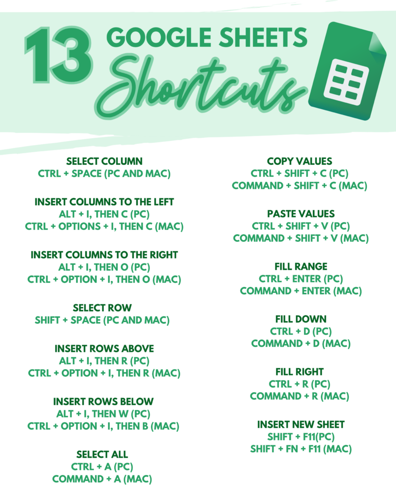
5. Use Google Sheets Keyboard Shortcuts
There are so many shortcuts to be taken advantage of in Google Sheets! Here are just a few of my personal favorites:
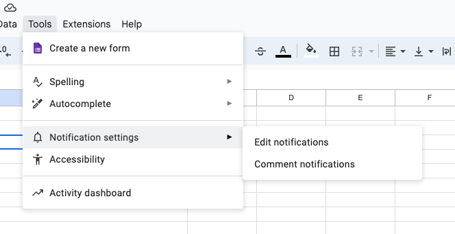
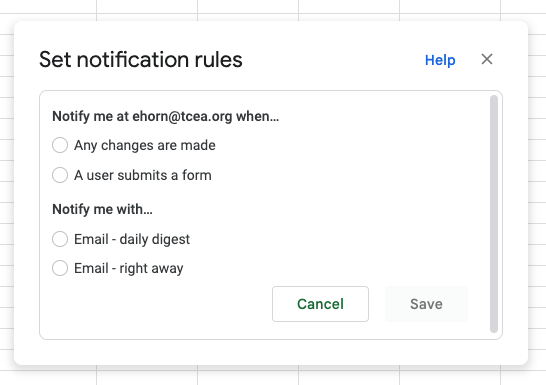
6. Get Notifications of Changes
Did you know you can get notified anytime a change has been made to your spreadsheet? You can! Click on Tools, Notification settings, and then edit notifications.
Select to be notified when “Any changes are made” and then make your choice for a daily digest or an immediate email.
7. Protect Parts of Your Sheet and Make Other Parts Editable
Let’s say you want students to add to your sheet, but you don’t want anyone to edit your formatting! No problem. Right click on the sheet and select Protect sheet.
Then, you can enter a description and select which cells and ranges you don’t want protected, which means they can be edited. Pretty cool!
8. Use Macros to Help You Complete Tasks in One Click
This one is truly amazing. You can literally record your screen (“Record a macro”) as you’re completing any task (averaging grades, formatting a sheet, setting up a calendar, etc.) within a spreadsheet. Then, instead of completing the same task step by step the same way over and over and over again to multiple sheets, you can just run the macro, and it will do the task for you. Mind. Blown. Take a look at this video example.
Have any of your own tricks up your sleeve? Share them with us in the comments below. The more tips, the better!
Do you ever wish the color of your spreadsheet rows would change color to match the content? If yes, you may enjoy learning about conditional formatting. Conditional formatting is a wonderful feature in Google Sheets and Microsoft Excel. Let’s explore how to use custom formulas that can change the color of cells and rows of data based on the data in a cell.
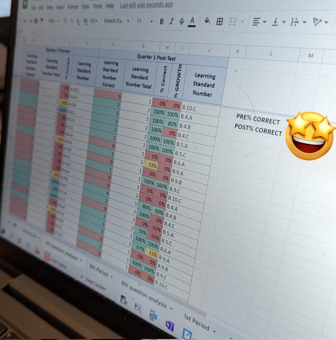
Diving 🏊♂️🥽🌊 into #GoogleSheets with Biology to show how Ss grew from pre- and post-Quarter 1 test using TEKS and a little conditional formatting. Source: Lauren Hawkins’ (@EdTechHawk) Tweet
Meet the Problem
“Oh, I use conditional formatting all the time. But I want to change the colors of the first column when the data in the last column changes. How could I do that?”
It might help to see what this problem looks like. Most spreadsheet users know you can use conditional formatting.
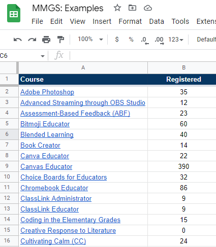
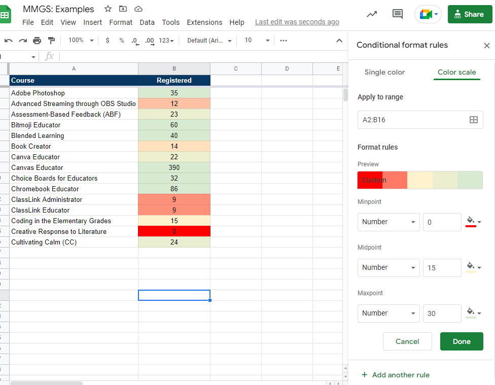
Consider this spreadsheet, which represents a list of workshops and the number of registrants for each course:
Conditional formatting could allow me to change the colors. For example, I could add conditional formatting rules for different conditions. Let’s take a look at examples.
1) Create a sliding color scale.
These settings would adjust the colors of the cells where values appear. For example, the minimum number “0” would be red. The midpoint (“15”) would be yellow, and the maxpoint (“30”) would be green. You can see what that looks like below, as well as take a look at the color scale:
2) Apply single colors.
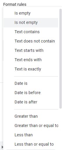
This is the most often used conditional formatting solution. In this case, you can use a variety of format rules. These format rules say, “Format cells if…” certain conditions are met. Here is the list of most conditions you can apply:
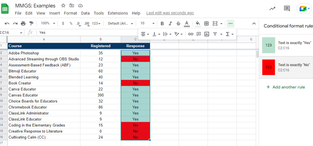
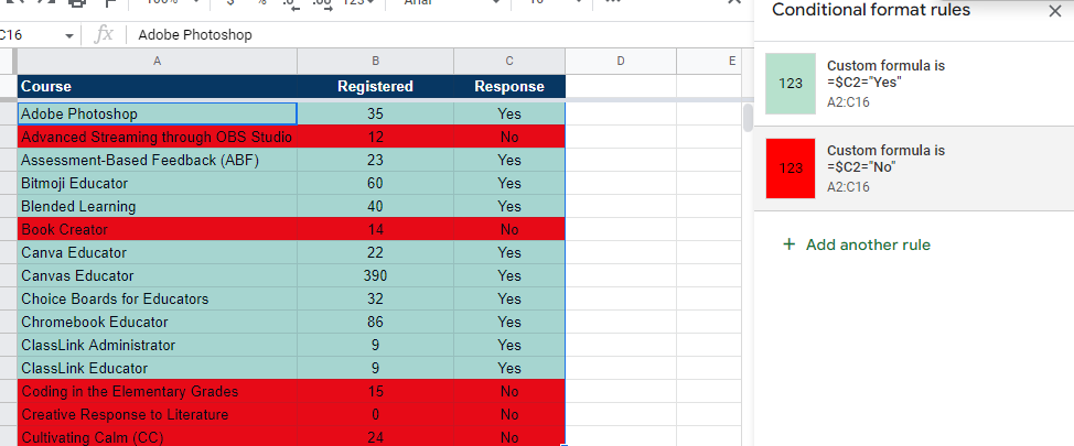
I often use these when getting data from a Google Form, and I want to see how YES or NO responses look.
As you can see in the screenshot above, conditional formatting changes the color of the cell. The colors depend on the value in the cell. In this case, “Yes” is green, and “No” is red.
But what happens when you want the entire row to be green or red based on the YES or NO? That’s where custom formulas come to the rescue.
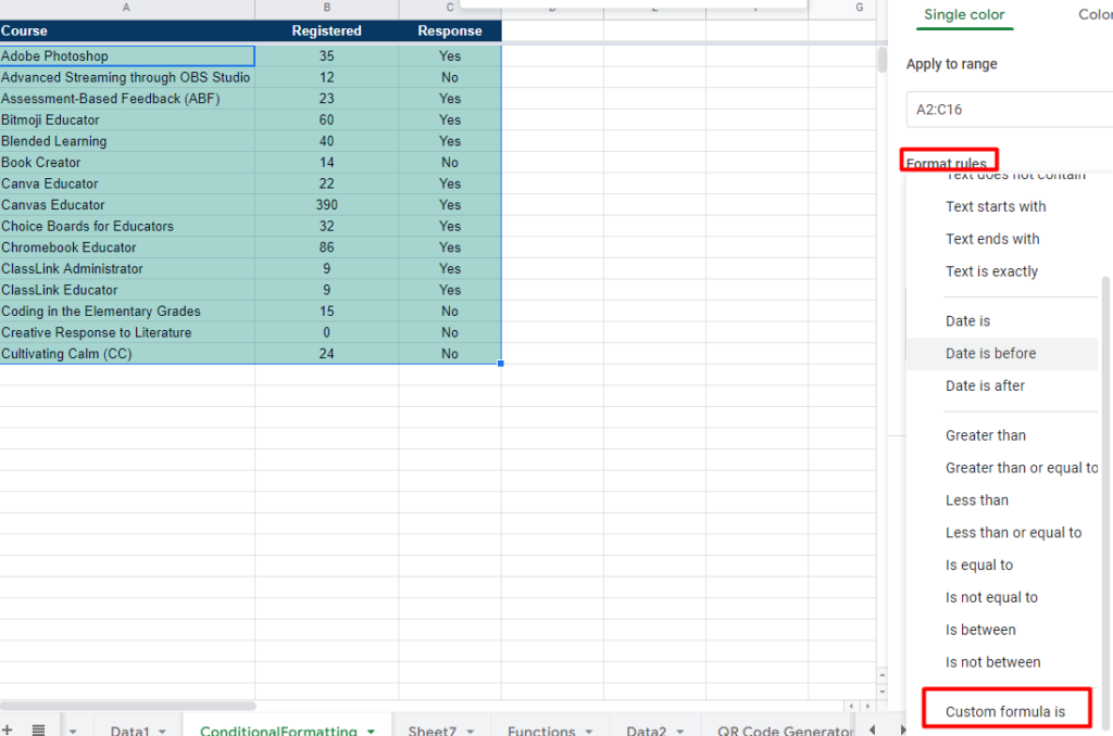
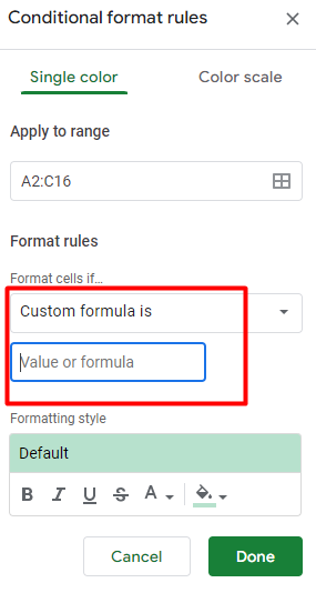
Introducing Custom Formula
Custom formula makes it easy to apply colors and formatting to an entire row of data. After you highlight the rows you want to apply conditional formatting to, go to Format -> Conditional Formatting. Then, enter a formula into the “Custom Formula” option, as shown below:
You can see that you will need to enter a “value or formula” into the custom formula box:
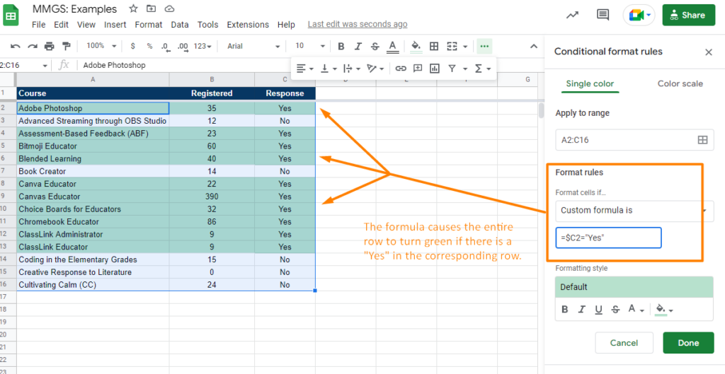
This will allow you to enter a formula for the conditional formatting rule. In this case, I want two rules to be present:
When the word “Yes” appears in column “C,” the entire row to turns green
When the word “No” appears in column “C,” the entire row to turns red
But how do you do that? What do you type into the custom formula box?
Here’s what that looks like with one custom formula rule applied:
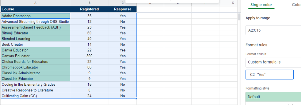
Notice that the $ in the formula applies formatting that matches the row of data where it appears (A2 to C2, A3 to C3). This is referred to as “absolute references” rather than relative references. If I were to not include the dollar sign, only the first column would change color, as you can see below:
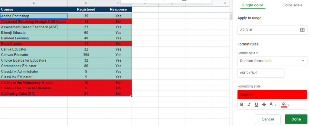
To add the red fill color to each cell in a row, I have to add another rule:
Both of the custom formula rules appear below:
When the word “Yes” appears in column “C,” the entire row to turns green: =$C2= “Yes”
When the word “No” appears in column “C,” the entire row to turns red: =$C2= “No”
And that looks like this:
Isn’t that cool?
Want to Learn More?
As a Google Sheets user, I often find myself learning new things about stuff I thought I knew. I’ve been using conditional formatting for years. Yet, I never thought to scroll to the bottom of the formatting rules to see what else was there! Now that you know about custom formulas in conditional formatting, how will you use them?
Learn more about conditional formatting and Google Sheets:
Have you ever tried to cut a tree down with a hammer instead of a hatchet? If you know how these two tools work, you won’t even try. But that’s what we do with digital tools every day. Imagine if you knew a simple hack for turning a hammer into a hatchet. It could save a lot of time, effort, and money.
It was only last month that I found myself dealing with tons of data. What I wanted was simple, but I had no idea how to get Google Sheets to reveal the data. The answer? Use a function I had never heard of. This experience convinced me to try and learn about new functions.
So now, I want to share some of my favorite tools and functions of Google Sheets– tools and functions that can help you avoid the frustration of trying to cut a tree down with a hammer instead of a hatchet. In other words, they can make your work a little easier.
I’ve been using spreadsheets since I was 13 years old, but I still know very little about them. That’s because I’m always focused on the problems I have to solve. But if you take a moment to look around, you’ll realize that you don’t always have to use the same tools to solve problems. And Google Sheets is certainly a tool for solving problems. Examples of problems Google Sheets can solve include:
Making sense of complexity or representing data in easy-to-understand formats like graphs
Sorting and filtering data to see relationships
Calculating and summarizing
Connecting more efficiently with others
Add-Ons and Extensions for Google Sheets
If you’re like me, you may have reached for some digital helpers like Google add-ons or extensions to Google Sheets. Some of my favorite solution helpers for Google Sheets include these power tools from Hymel Stayte’s Solutions:
If you have more add-ons that you like for Google Sheets, please feel free to share those in the comments. But what if these power tools are too much for what you are trying to do? Or what if you need to dig into your data in a way that’s incongruent with these add-ons?
It’s time to explore some of my favorite functions below.
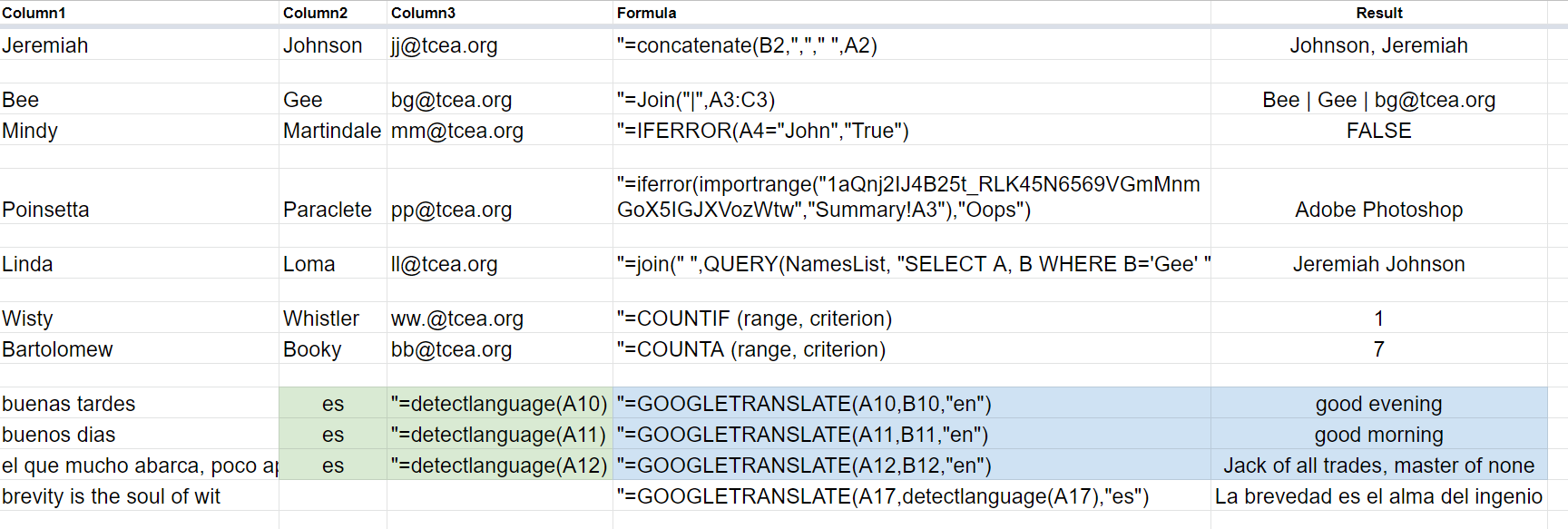
One simple example that a lot of folks don’t know about that I use every day? Concatenate.
=Concatenate(A2,” “,B2,”<”,C3,”>”)
This allows you to put text together. My biggest use involves concatenating text such as firstname, lastname, and email. I use the result to enroll people in Canvas LMS.
Another one that I didn’t know about but is so powerful: IFERROR. It prevents showing a nonsensical error. Instead, it shows you a message you can customize.
Each of these expands your repertoire of what’s possible in Google Sheets. Take the time to learn them and practice them.
=join(“,”,A1:A5)
=IFERROR(value, [value_if_error]) (See more)
=IMPORTRANGE (sheet_url, range_string)
=QUERY(NAMEDRANGE, “SELECT A WHERE B=‘Google Sites’ “)
=COUNTIF (range, criterion)
=COUNTA (range, criterion)
=DetectLanguage(B2) with =GoogleTanslate(B2,C2,”en”)
Need a few more?
Get the “Make Magic with Spreadsheets” Wakelet
Want to get more examples in video format? You may want to check out this Wakelet where I’ve curated a few videos and tutorials.
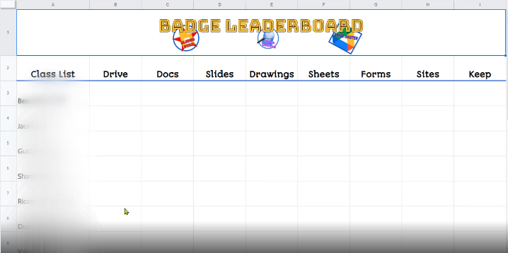
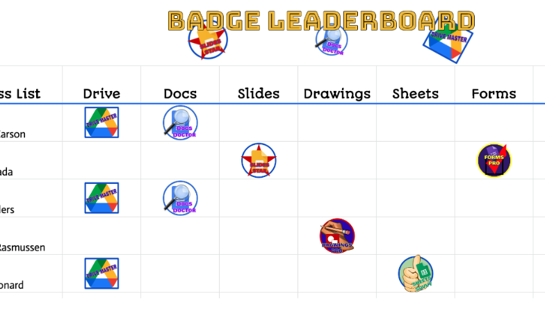
TCEA Area 15 Director, Sherry Hall, has an excellent idea for creating a digital badge leaderboard to enhance student engagement. You can create your own spreadsheet and badges or edit this template that Sherry has already created! This template is ready to go with badges, tabs, and formulas– it just needs your customized class list, skills, and badges. If you want to get creative and make your own, let’s walk through how Sherry does it. Watch the video and/or check out the steps outlined below!
How to Create a Badge Leaderboard Worksheet Using Google Sheets by Sherry Hall
Create Your Tabs
Type sheets.new in your Chrome search bar to open up a new Google Worksheet, and follow the steps below to get started.
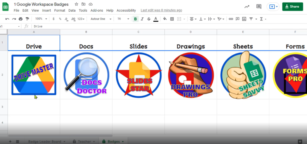
Tab 1: Open Google Sheets and create a “Badge Leaderboard” tab. In Sherry’s example, she has her class list in the first column, a title and image in the first row, and the tools students are working on mastering as titles in row two (Drive, Docs, Slides, etc.). Here, we can see she is working on skills in Google Workspace.
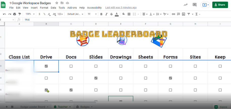
Tab 2: Make a copy of the leaderboard tab by right-clicking on the tab and selecting “Duplicate.” Name this tab “Teacher,” because it’s just for you. Place checkboxes in each cell under the skills for each student name by highlighting the cells, clicking “Insert” in the menu bar, and then clicking “Checkbox” in the drop-down menu. Checkboxes will appear in all the cells you’ve selected.
Tab 3: Make a copy of the “Teacher” tab and name this tab “Badges.” Remove the class list column and the row one image, so only the tools appear. Insert the badges you’d like each student to receive for mastering each tool. To do this, select the cell, click “Insert” in the menu bar, click “Image,” and select the “Image in cell” option. We can see here that Sherry has inserted coordinating badges for each tool.
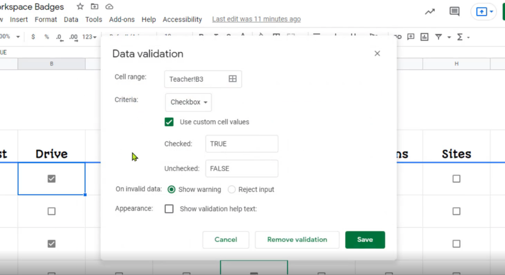
Set Up Data Validation
Go back to your “Teacher” tab, and click on “Data” in the menu bar.
Then select “Data validation” in the drop-down menu.
A pop-up box will appear, and you will need to make sure the criteria says “Checkbox,” the “Use custom cell values” box is checked, and set checked boxes to be “TRUE” and unchecked boxes to be “FALSE.”
Once these are set, click “Save.”
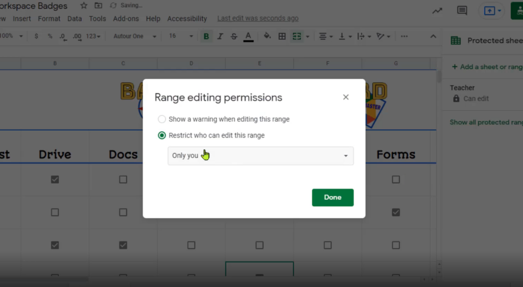
Protect Teacher and Badges Tabs from Student Editing
Under “Data” in the menu bar, click “Protected sheets and ranges,” and a menu will appear on the right side of the screen.
Select the “Sheet” tab, and click “Set permissions.”
Click “Restrict who can edit this range, and select “Only you” from the drop-down menu.
Click “Done.”
Click on your “Badges” tab and do the same!
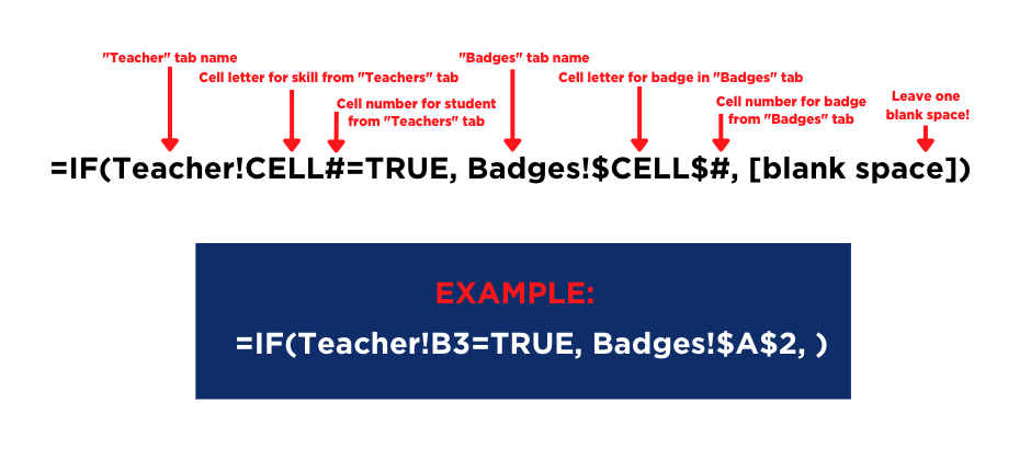
Insert the IF Formula
I promise this isn’t as hard as it seems! You will only need to do one row of formulas, then drag the row of formulas down to fill the page, and Google Sheets will magically take care of the rest.
On the “Badges Leaderboard” tab, you will need to insert an IF formula in the first student’s row for each skill. Note: You can copy and paste the one I provided below and edit it as needed.
2. To do this, you will structure your formula like this:
Copy this formula to edit and use in your Google Sheet—> =IF(Teacher!B3=TRUE, Badges!$A$2, )
3. Once you’ve inserted the formulas in each row one cell for the first student, select all the cells in row one for that student, click the blue box in the bottom right corner of the last cell, and drag down over all the cells, like this:
Watch to learn how to quickly fill cells with a formula in Google Sheets!
4. As students master each skill, check the boxes in the “Teacher” tab, and the “Badge Leaderboard” will auto-populate with badges! Pretty neat.
You can also download the entire folder of resources here. Thanks to Sherry for this fantastic idea! I can see this being used in a variety of ways at any grade level. How will you use a digital badge leaderboard? Leave us a comment to let us know.


")