Discover resources and strategies for teaching core content areas. Explore tips, tools, and activities to enhance learning across all subjects.
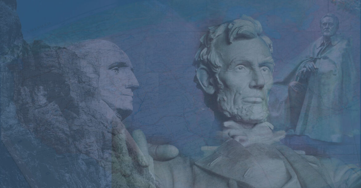
The holiday commonly known as Presidents Day honors the birth of U.S. presidents George Washington and Abraham Lincoln. Throughout the United States, it’s commemorated on the third Monday of February. While it was originally a celebration of the first U.S. president’s birth, it’s now an occasion to remember and study all of America’s presidents.
Virtual Visits
Whether teaching remotely, in-person, or in a hybrid way, educators can help students explore the history and impact of the nation’s chief executives through innovative virtual field trips. Here are a few you might find useful.
Home and Hearth
One great way to build context around the life and times of the presidents is to tour their homes. Especially for America’s earliest leaders, this can be a great way to prompt discussion, reflection, and understanding of life in earlier times.
- Mount Vernon: Experience the first president’s life at Mount Vernon, George Washington’s Virginia plantation, with this virtual field trip.
- Monticello: The home of America’s third president, Thomas Jefferson, includes his many inventions, agricultural innovations, history of the plantation itself, and the slave-based economy of early America.
- Lincoln Home National Historic Site: With the help of the National Park Service and Google Arts & Culture, you can page through this visual-and-text-based tour of Abraham Lincoln’s birthplace.
At the Library
Libraries are, of course, a great place to start for any knowledge-finding endeavor. Presidential libraries, which commemorate and archive records of various presidents, can be a good place to learn more, find primary documents and useful exhibits, and take a virtual field trip.
- Franklin D. Roosevelt Presidential Library and Museum: The FDR library has a ready-made virtual tour for you to take no matter where you are.
- Eisenhower Presidential Library and Museum: Take a video-based look around the Eisenhower library here.
- John F. Kennedy Presidential Library and Museum: Sit at the famed Resolute Desk in this interactive exhibit, explore more digital exhibits, and even an iPad app.
- Richard Nixon Presidential Library and Museum: Walk through exhibits, Nixon’s birthplace, and the Nixon library’s gardens here.
- Jimmy Carter Presidential Library and Museum: You can visit Carter’s virtual library with this Google Street View tour.
- Ronald Reagan Presidential Foundation and Institute: Jump into virtual field trips here, and dig into the virtual learning hub here.
- William J. Clinton Presidential Library and Museum: Look through items from the collection in this virtual tour, and check out the digital exhibits on display here.
More to Explore
Other historical sites of interest include virtual tours, exhibits, and digital field trips.
- Ford’s Theater: Go behind the curtain to learn more about the site of Lincoln’s assassination.
- The White House: Learn more about the home of the sitting president.
- Mount Rushmore: Discover the history of this presidential monument.
What sites will you explore for Presidents Day? Share your ideas in the comments!
Photo of Mount Rushmore by Todd Trapani from Pexels
Photo of FDR Memorial by Pedro Gutierrez from Pexels
Photo of U.S. Map by John-Mark Smith from Pexels