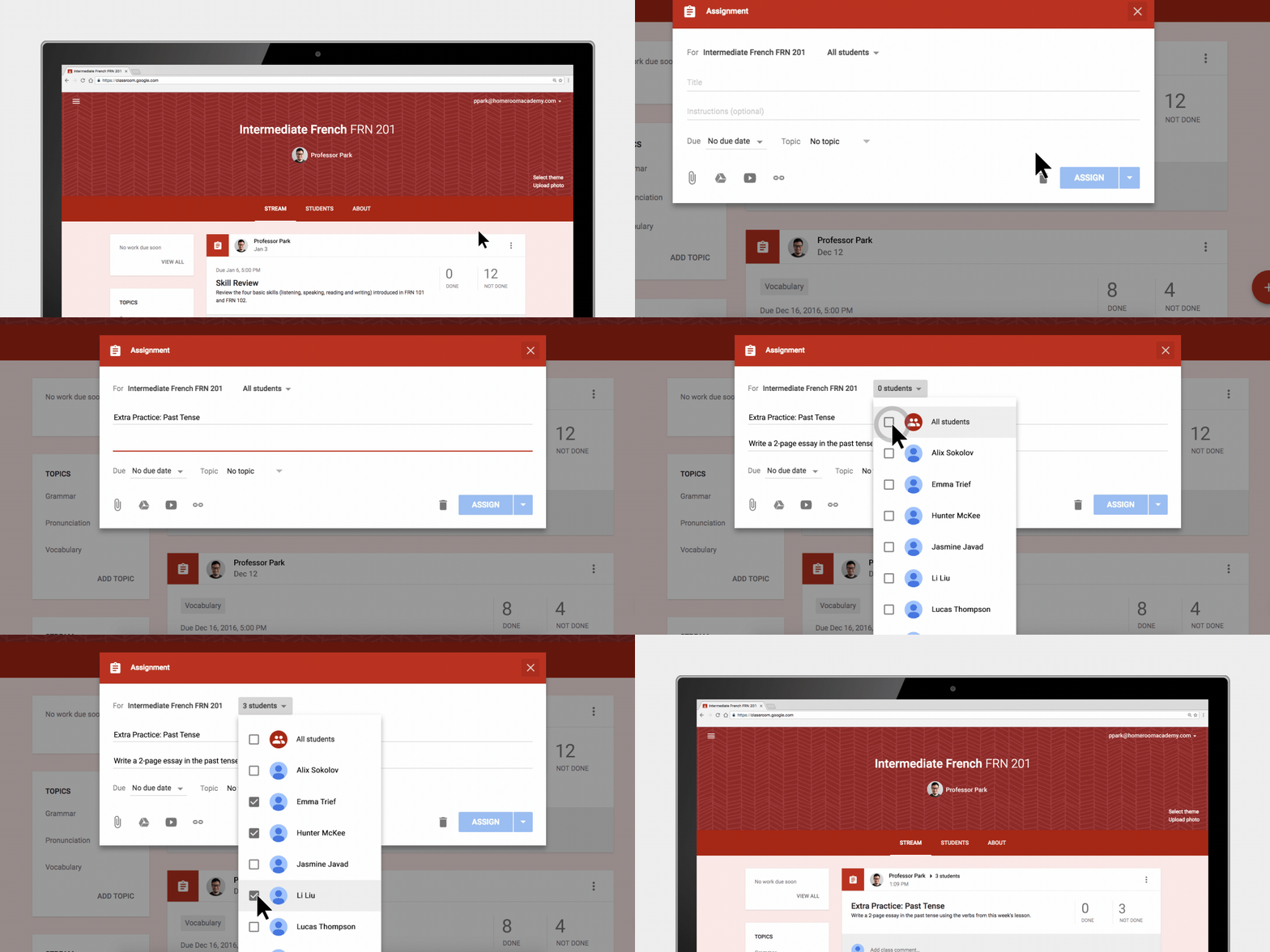
A few weeks ago, Google rolled out a fresh new look for Google Classroom. Many teachers want to keep their Google Classroom organized and clean and the new updates will help accomplish this.
A Cleaner Look
When teachers log into Google Classroom, they will notice that Classroom has a new look and feel. At first, notice the new white background. Then, when you get into one of your classes, an obvious change you will see is that the class code is now located at the top on the header. There is also a new display icon next to the class code. When you click on it, the class code will appear largely and clearly. This makes is a lot easier to project your class code so new students can join your class.

Drag and Drop Assignments and Topics on the Classwork Page
The Classwork page allows teachers to post assignments and questions. To better organize your classwork page, you can even group those assignments and questions into topics. For additional flexibility, Google has now added the ability for you to drag individual items within and between topics. You can even drag an entire topic to another location on the Classwork page. This will make rearranging and organizing your classroom even easier.
Personalize Your Google Classroom with New Themes
Google has introduced 78 new themes so teachers can now personalize their Google Classroom. The themes come with custom illustrations, ranging from history to math to photography. It’s now even easier to customize your Classroom than ever before. All you have to do is click on Select Theme and choose one of the nice new backgrounds. Of course, you still have the option to upload your own photo.
Hopefully, these are some changes that will be beneficial to you. Stay tuned to our blog for new updates to Google as they come out.


 Class Notebook

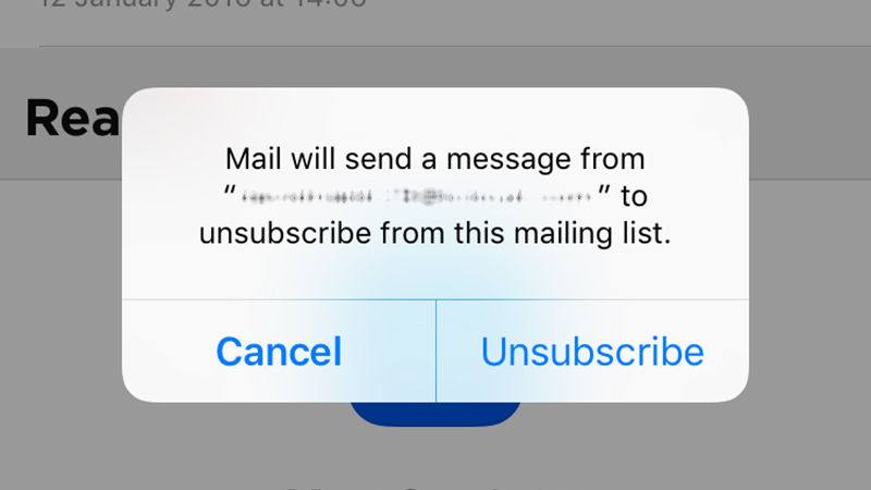 Get Rid of Unwanted Email Subscriptions – iOS 10 attempts to identify emails for which you have subscribed and now gives you an unsubscribe banner that’s easy to see (no more searching for the Unsubscribe link at the bottom of the email). Just tap the banner to automatically unsubscribe. (Of course, you wouldn’t want to do that with any email coming from TCEA!)