Supporting digital accessibility remains a key priority for schools and organizations. As a blogger and website designer, I often despaired of my efforts in the area of digital accessibility. What actions should I take to make content more accessible for others? How could I better optimize my text for screen readers?
When I began working as a school district technology director, I was able to address the issue, and I’ll share several digital accessibility rubrics.
Did You Know about WAVE?
WAVE is suite of tools to help web you make your web content more accessible. Use the form at https://wave.webaim.org/, enter the web page address of your page and submit the form. You can find Firefox and Chrome extensions for evaluating pages. You can also find site-wide WAVE tools for evaluating pages. Learn More.
Why Make Content Accessible
For me, the answer is simple. When I don’t make content accessible, there is a world of people who are cut off from the content. As Kaitlyn Nielsen points out, accessible content improves access for all. She says:
Content is a critical part of your accessibility strategy. It improves the web experience for all users, not just people with disabilities.
In 2020, Raymond Rose, a TCEA member, wrote this as a comment on a previous blog entry:
“I wish that you’d include some information about making the website fully accessible (WCAG 2.1 AA). A survey of some 6k LEA websites a year ago found that only ~60% passed the webAim WAVE review.
We know that tool does not pick up all the accessibility issues. If teachers are doing websites for communications, they should be communicating with everyone.”
As you might surmise, there are a wealth of tools available to content creators. The question I have: How can we leverage these tools to improve digital accessibility? It’s an important question, and one that I can’t take credit for asking.
The Need for a Simple Rubric
In a recent TCEA Community chat, Raymond made an assertion I had to respond to.
“It would be nice if there were a simple rubric to assess digital accessibility,” said Raymond Rose. He then said, “Unfortunately, that doesn’t exist.” How could I resist the challenge of trying to make a simple rubric?
The rubric I curated and adapted addresses some key areas that Raymond identifies as important, as well as others. In his TCEA Community remarks, he highlights the United States Department of Justice. The US DOJ says:
…businesses “can currently choose how they will ensure” web accessibility. DOJ identifies the “Web Content Accessibility Guidelines (WCAG) and the Section 508 Standards. The federal government uses these for its own websites… (Source: Morgan Lewis)
Keep in mind that creating a simple rubric can be difficult. The topics are tough and can be technical. It’s important to have some way to assess the tools we use as educators.
I wish that you’d also include a comment about the accessibility or lack of accessibility for students with disabilities for each tool you review. Teachers should not be using a tool if it is not fully accessible. Source: Raymond Rose
It’s easy to get lost in the weeds, especially with a holistic or analytic rubric. To avoid confusion, I decided to use a single point rubric format.
The Single Point Rubric
Mary Dietz (2000) created the single point rubric. As Jennifer Gonzalez (Cult of Pedagogy) points out:
- For teachers, they are easier and faster to create. Why? You don’t have to spend time thinking up ways people can fail to achieve the ideal.
- For students, they are simpler to understand and process.
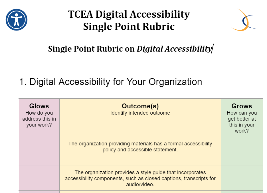
You can also use them to focus users on reflection, as you will see in my version of the single point rubric. It’s simple! The header has three columns:
- Glows: How do you address this in your work?
- Outcome(s): Identify intended outcome
- Grows: How can you get better at this in your work?
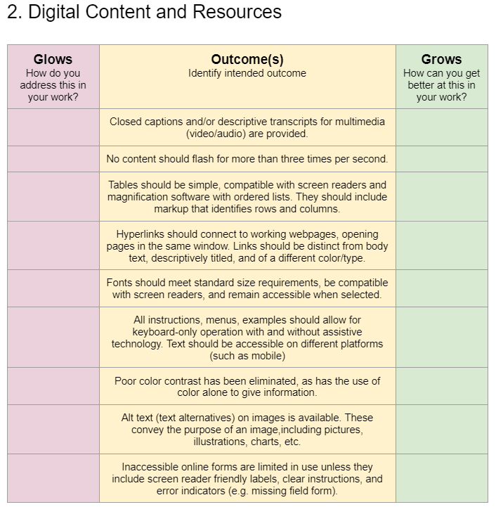
When I first started, I had more complex column headers. I stripped out unnecessary words. The rest of the rubric tries to do the same. Give it a try, either for your organization or for your content and resources.

View complete rubric | Get a copy of the Google Doc
Reading and reflecting on the Grows question for my own work, I could see there might be room for growth. How would such indicators and questions cause your organization to grow?
More Rubrics and Resources
What? You wish there were more rubrics? You wish the rubric above addressed more areas? You may be longing for more complexity. If you’d like to see other examples, explore this Wakelet Collection.

Feature Image Source
Screenshot by author

