Explore tools, strategies, and resources for teaching history. Engage students with activities and insights to bring the past to life.
A teacher at a high school opens the semester with a policy: Your work may contain up to 20% Gen AI content. Cite it, or you get a zero. Is this an enforceable policy? It’s built on the assumption that an AI detection tool will catch what the policy intends to prevent. That assumption has been wrong for a long time and a lot of teachers are finding that out the hard way. Across the country, educators are writing AI policies that name a number they cannot verify, backed by detection tools that flag innocent students and miss guilty ones with comparable frequency.
A better move may be to stop designing assignments that Gen AI can complete. That means shifting from product to process, from long take-home essays to shorter in-class work, and from “write what you know” prompts to strategies that require students to think out loud, in front of people. None of the following require a detection tool. All of them generate real evidence of learning. This blog entry continues to offer suggestions in the spirit of getting students to show what they know, not unlike these other blog entries about VIVA framework and embodied learning.
1. Build Writing as a Process, Not a Submission
“Wait, we have to turn in the outline too?”
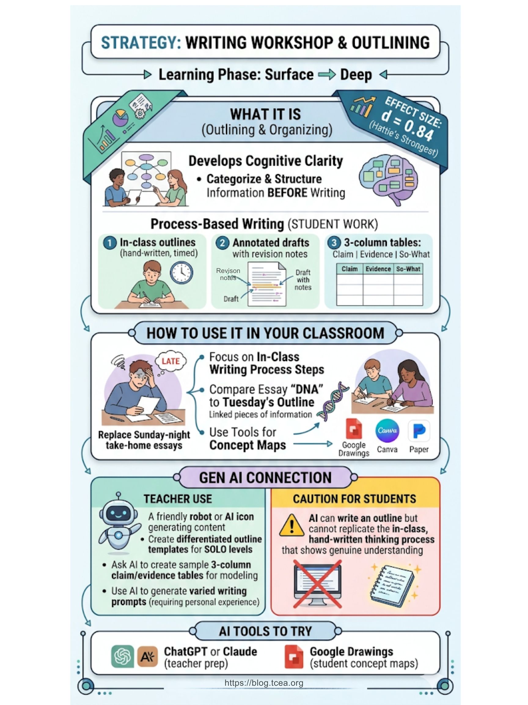
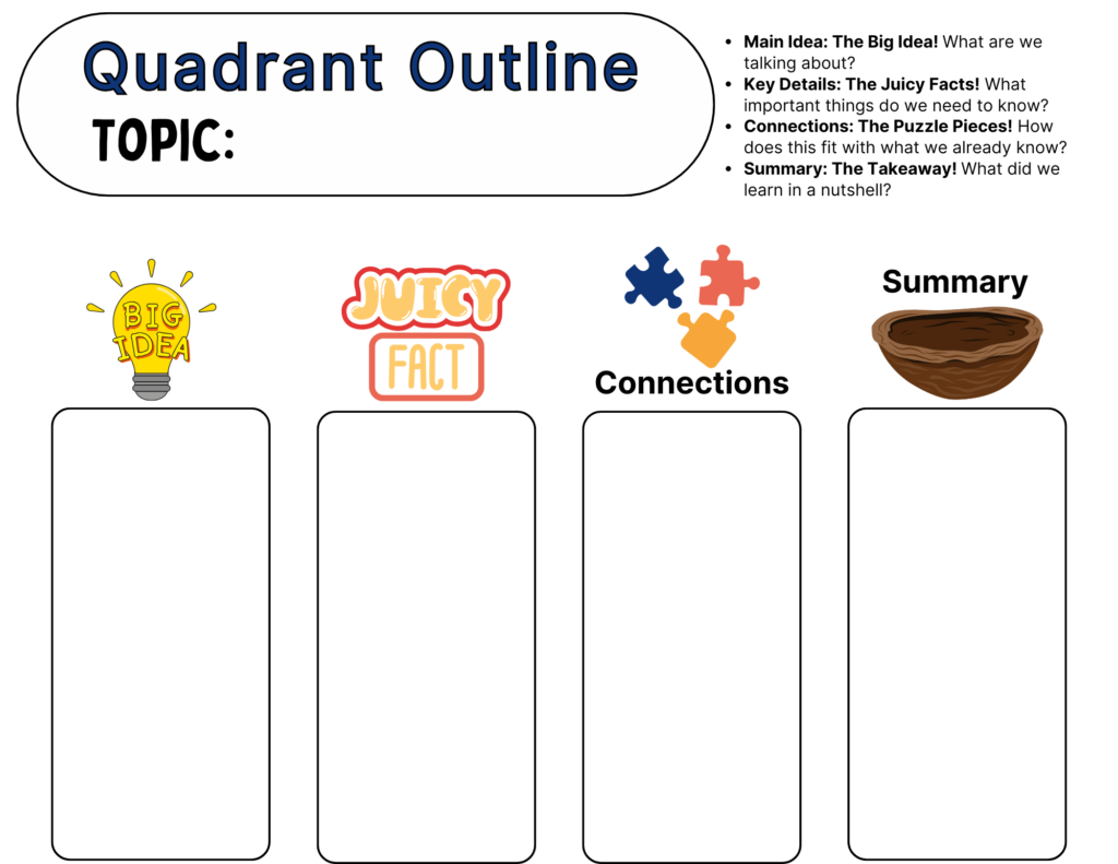
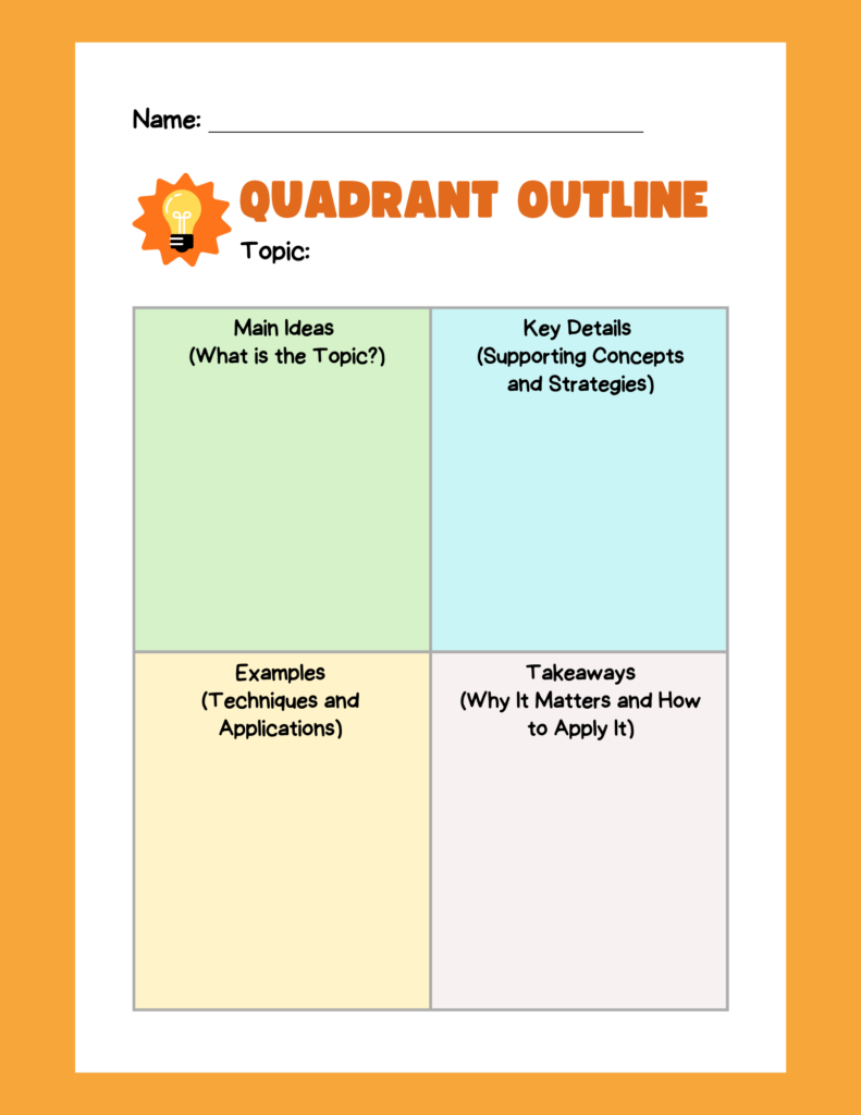
Yes. That is exactly the point. A finished essay submitted Sunday night is a product. Gen AI is very good at producing products. What it cannot produce is a documented, in-class process that matches a specific student’s thinking on a specific day. I still recall relying on manila folders to capture students’ thinking from day to day, week to week, in their own handwritten drafts.
Outlining and Organizing carries an effect size of d = 0.84 in Hattie’s research, making it one of the stronger instructional moves available for writing instruction. The Visible Learning MetaX database entry describes it as a strategy that develops cognitive clarity by helping students categorize and structure information before they write.
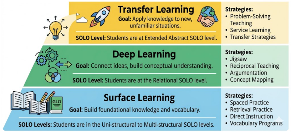
This is a surface-to-deep learning strategy. Concept maps and rough outlines build the foundation. Annotated drafts and revision reflections move students toward deeper processing. Together they give you multiple data points over time, and if the final essay shares no DNA with the outline a student submitted in class on Tuesday, you have an honest conversation to have, and actual evidence to ground it.
Claim, Evidence, So-What Statement
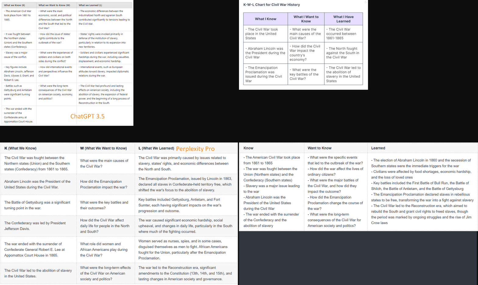
Use a simple three-column table in class: initial claim, key evidence, so-what statement. Students fill it out by hand in ten minutes. That may show you more about what a student actually knows than most submitted drafts ever do.
| Initial Claim (Main Idea/Goal) | Key Evidence (Strategies/SOLO Levels/Data) | So-What Statement (Meaning/Gen AI Connection) |
|---|---|---|
| 1. Learning must progress from surface-level understanding toward genuine deep knowledge and the ability to transfer that skill. | – SOLO Levels define the stages (Uni-, Multi-structural → Relational → Extended Abstract). – Strategies like Jigsaw (d=0.92), Argumentation (d=0.82), and Problem-Solving (d=0.61). | To distinguish genuine student learning from AI-generated “words only,” educators must focus on assessable, in-class timed tasks that require students to transfer internalized conceptual frameworks to completely new, novel scenarios. |
| 2. Effective lesson design requires a structured, interconnected framework that prioritizes psychological safety first. | – The ALDO Framework (5 Steps): 1. Build Relationships/Safety, 2. Pre-Assess, 3. Select Strategy (based on SOLO phase), 4. Post-Assess, 5. Reflect/Share. – Students need psychological safety to discuss and teach. | Modern lesson planning requires connecting social-emotional learning (SEL) with high-effect cognitive strategies; the “ALDO” structure ensures these phases are deliberate and connected, moving beyond passive learning activities. |
| 3. High-effect feedback is the critical factor that closes the learning gap, and AI can accelerate its delivery. | – Reinforcement/Cues (d=1.01). – Timing of Feedback (d=0.89). – Immediate feedback prevents misconceptions. – Key feedback questions: What can/can’t the student do? How does it compare? How to improve? | Instead of banning AI, teachers should utilize it as a tool to rapidly generate varied scenarios and feedback templates. This frees the teacher to provide the essential, immediate human reinforcement and immediate guidance needed to support deeper reflection. |
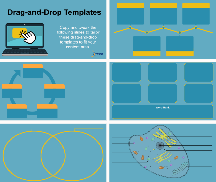
Try Google Drawings or Canva for digital concept maps, or skip the tech and use paper.
2. Assign Shorter, In-Class Pieces
“We’re writing right now? I didn’t bring anything.”
That is the idea. A five-paragraph essay assigned for homework is an open invitation. A one-paragraph response written in 15 minutes at the start of class is not. Timed, in-class writing gives you a direct sample of what a student can produce without outside assistance.
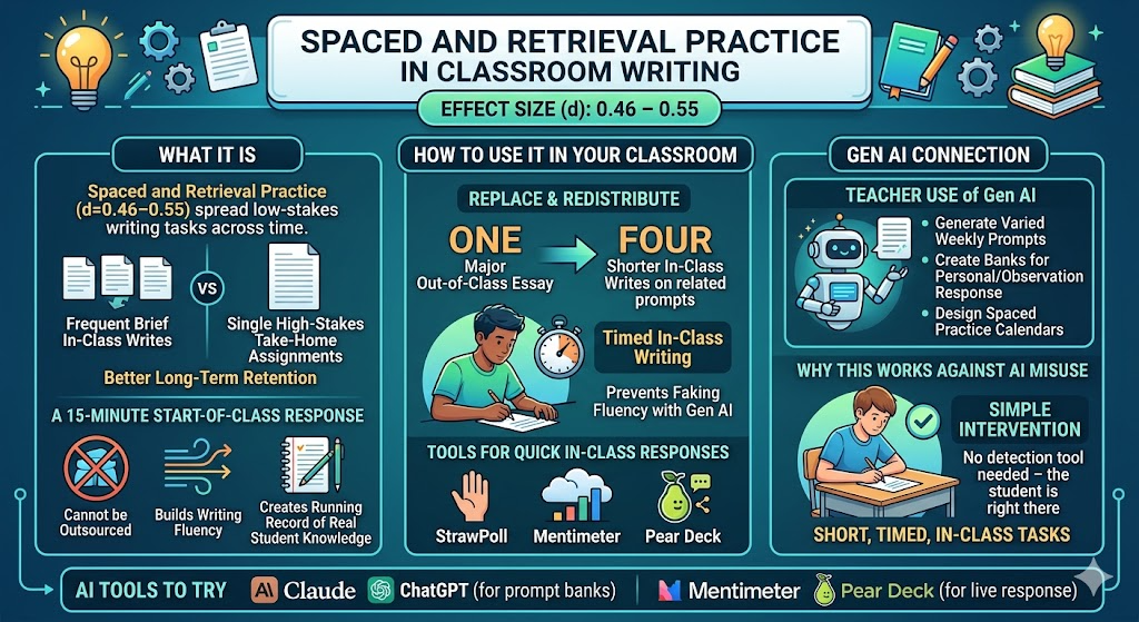
Spaced practice and retrieval practice each carry effect sizes in the d = 0.46 to 0.55 range, and short in-class writes activate both. The Visible Learning MetaX entry on spaced practice confirms that frequent, low-stakes tasks spread across time outperform single high-stakes assessments for long-term retention.
This is a surface learning strategy. The goal is fluency and retrieval, not extended analysis. Students who rely on Gen AI at home cannot fake that fluency when the clock is running, and students who write consistently in class develop the stamina longer assignments require.
Replace one major out-of-class essay per grading period with four shorter in-class writes on related prompts. You will collect more useful data, and you will spend less time second-guessing what you receive.
3. Use Reciprocal Teaching to Surface Real Understanding
“I have to explain evaporation to my group? I just read it.”
Reading it and explaining it are not the same skill. Reciprocal Teaching is a structured discussion strategy where students rotate through four roles: summarizing, questioning, clarifying, and predicting. It requires students to engage with a text in real time, in front of their group, and respond to what their peers actually say.
Reciprocal Teaching carries an effect size of d = 0.74. The Visible Learning MetaX entry notes that its strength comes from making reading comprehension visible and social rather than private and assumed.
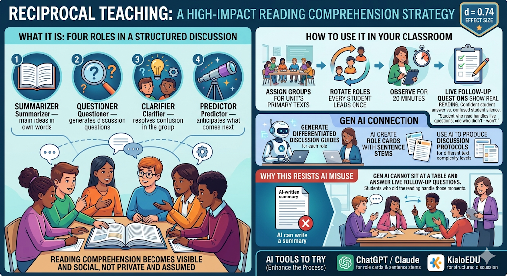
This is a deep learning strategy. Students must connect ideas, elaborate on their peers’ contributions, and adjust their thinking mid-discussion. Gen AI can write a summary. It cannot sit at a table and answer a classmate’s follow-up question on the fly. Students who read and processed the material handle those moments. Students who outsourced their reading do not.
Assign Reciprocal Teaching groups for your next unit’s primary texts. Rotate roles so every student leads at least once. Observe. What you see during those 20 minutes will tell you more than a detection report.
4. Run a Jigsaw Activity Instead of a Written Report
“My group is counting on me. I better actually read this.”
Jigsaw divides content across students, then reassembles them to teach each other as they move from home to expert to home groups. The research report becomes a teaching performance. Students who used Gen AI to “read” their section will struggle in front of peers who actually want to understand the material. Students who did the work won’t.
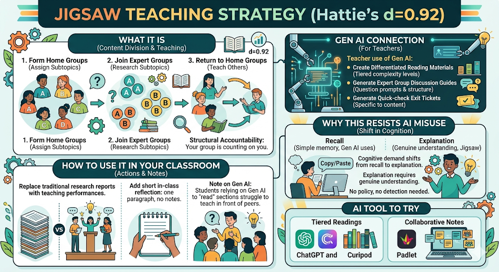
Jigsaw carries an effect size of d = 0.92, placing it among the highest-impact strategies in Hattie’s database. The Visible Learning MetaX entry attributes its strength to peer teaching: when students know they must explain content to others, they process it more deeply during preparation.
This is a deep learning strategy. The cognitive demand shifts from recall to explanation, and explanation requires genuine understanding. No policy required, no detection tool consulted.
After any Jigsaw, add a short in-class reflection: one paragraph, no notes. What you hear and read tells you exactly where each student’s understanding actually sits.
5. Assign Argumentation Tasks That Require Real-Time Thinking
“But she just said the opposite of what I was going to say. Now what?”
Now they have to think. Structured academic controversy, Socratic seminar, and four-corners debate all share one useful characteristic: students must construct and defend a position in response to what someone else just said. That is a live, improvised task, and a chatbot cannot prepare them for it in full.
Classroom discussion carries an effect size of d = 0.82. The Visible Learning MetaX entry identifies its value in pushing students past surface-level recall into reasoning and evidence evaluation, which is precisely what argumentation requires.
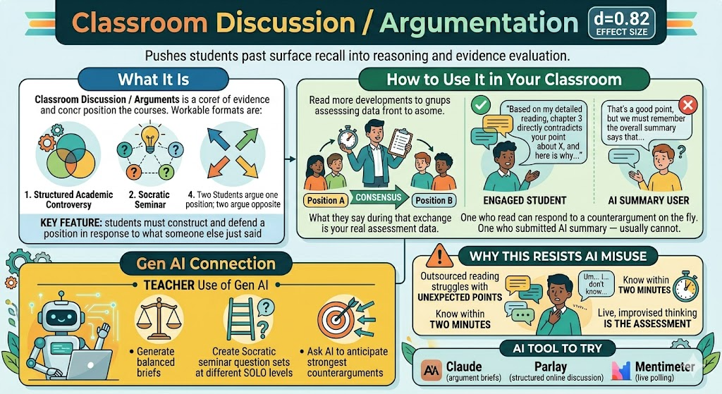
This is a deep-to-transfer learning strategy. Students begin by applying a position to known content, then adapt their reasoning in response to live challenge. A student who read and engaged with the material can respond to a peer’s counterargument on the fly. A student who submitted a Gen AI summary usually cannot. You’ll know the difference within the first two minutes.
After any reading assignment, assign two students to argue one position and two to argue the opposing view, then bring all four toward consensus. What they say during that exchange is your real assessment data.
6. Use Problem-Solving Tasks That Require Transfer
“I’ve never seen this passage before. How am I supposed to analyze it?”
With the framework you built over the last unit. That is the answer, and the test. Problem-Solving Teaching places students in a scenario where they must apply a concept or framework to a new, unfamiliar situation. Prior exposure to the content is necessary but not sufficient. Students have to think.
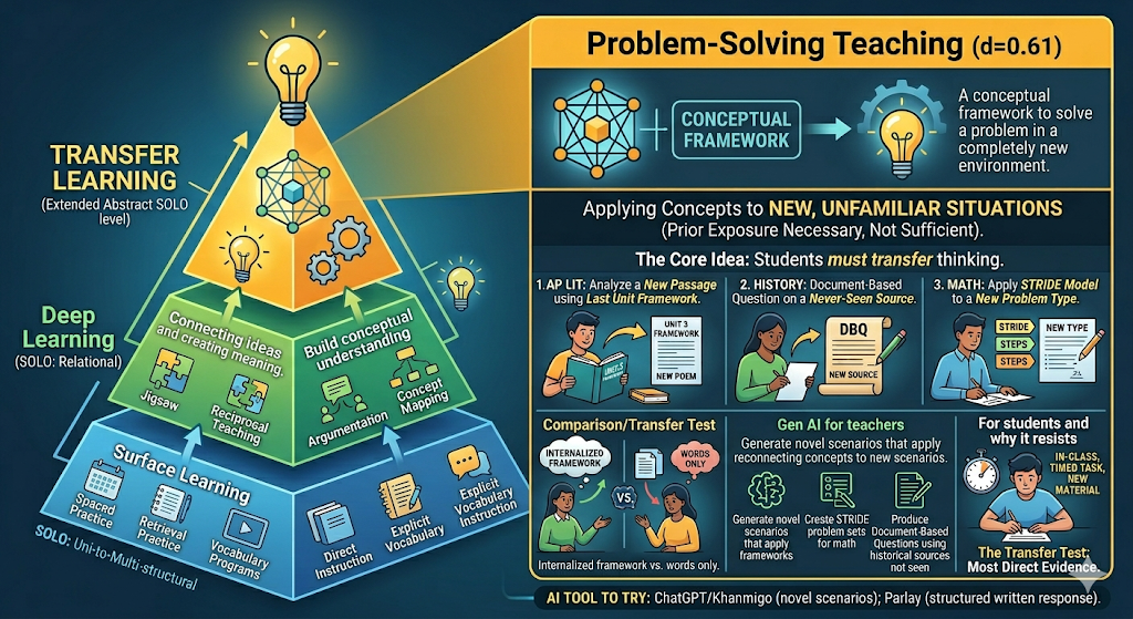
Problem-Solving Teaching carries an effect size of d = 0.61. The Visible Learning MetaX entry notes that its impact is strongest when students have enough foundational knowledge to attempt transfer, making it a natural capstone for any unit sequence.
This is a transfer learning strategy. In AP Literature, the task might be: “Here is a passage we have not read. Apply the analytical framework from the last unit.” In history, it might be a document-based question using a source students have never seen. A student who internalized the framework can use it here. A student who submitted a Gen AI version of someone else’s understanding cannot.
Replace one end-of-unit comprehension check per semester with a short problem-solving task: two to three paragraphs, written in class, using new material.
What These Six Strategies Have in Common
None of them require a detection tool. None ask you to enforce a percentage you cannot measure. All of them generate evidence that is genuinely difficult to outsource.
| Strategy | Learning Phase | Effect Size |
|---|---|---|
| Writing workshop and outlining | Surface to deep | d = 0.84 |
| In-class short writes | Surface | d = 0.46 to 0.55 |
| Reciprocal Teaching | Deep | d = 0.74 |
| Jigsaw | Deep | d = 0.92 |
| Argumentation and discussion | Deep to transfer | d = 0.82 |
| Problem-solving tasks | Transfer | d = 0.61 |
The 20% policy is a genuine attempt to address a real problem. The problem, though, is not that students have access to Gen AI. It is that the assignment gives them a reason to use it. Change the assignment, and the policy becomes much less necessary.
A Tool for You
Explore this tool for more ideas about applying what you can do. Use the classroom scenario generator.
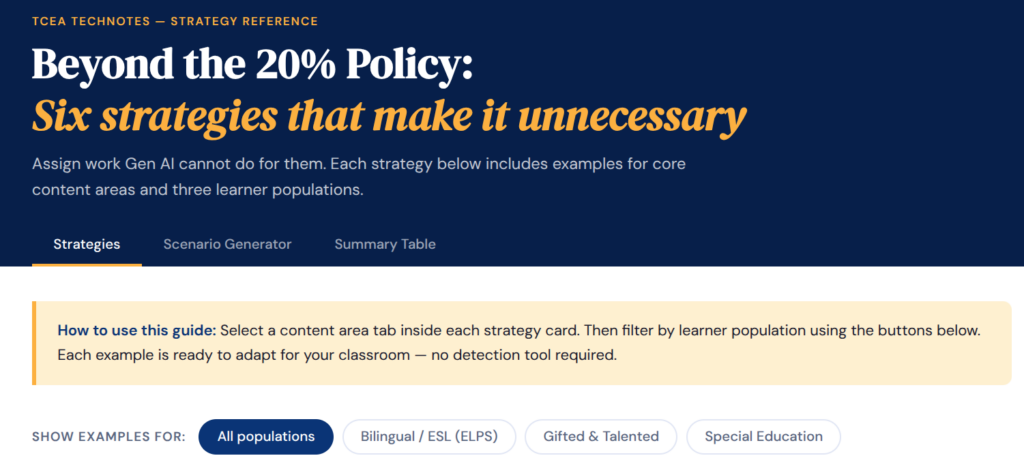
Classroom Scenario Generator:
Every scenario is drawn from the research-backed examples in the Strategies tab. Use the dropdowns to target a specific context, or randomize to surface a strategy you might not have considered. All examples are aligned to Hattie’s Visible Learning database and Texas ELPS standards where applicable.

Let me know what you think in the comments.

