“A high percentage of learners with Dyslexia are complaining about the white background in the new look Google Classroom – is there any way this can be changed?” asks United Kingdom educator, Scott H. There are several ways to “dim” the brightness of a screen and to protect your eyes. How do you accomplish this? You use a Chrome extension.
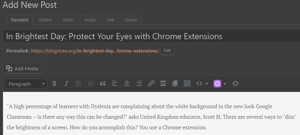
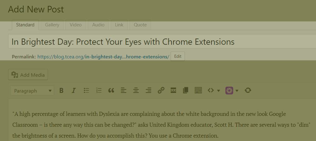
An example of “Care Your Eyes” extension effects applied to your Chrome browser
Why Adjust the White Background?
“Dyslexia is a learning disability that impairs a person’s fluency or accuracy in being able to read, write, and spell,” says Anthony (Source). Anthony points out that putting black text on a white background, or white text on a black background can result in a “blur” effect. He puts it this way:
Another kind of visual distortion effect that can occur among dyslexic users is the blur effect [1]. This is when dyslexic readers see their text blurring or swirling or together [5]. This can significantly affect a dyslexic user’s reading ability, and make reading tiring for them [7]. You can lessen this effect by avoiding a couple of bad practices.
Contrast sensitivity comes into play, as you can see in the image below:

Read more about contrast sensitivity
To avoid the blur effect that comes from a white background on a website like Google Classroom, you have several options to minimize the impact on dyslexic students. Let’s review them.
Option #1 – Use Care Your Eyes
The Care Your Eyes Chrome browser extension, available for free, allows for several options. You can see them in the screenshot below:
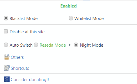
You have the choice to “Disable at this site,” which turns it off for certain websites. That means, that you could enable Care Your Eyes for Google Classroom but leave Care Your Eyes extension off for others.
Option #2 – Visor
Visor describes itself as a “screen dimmer and reading aid.” It suggests that the extension may help with fluency and eye-strain. What’s more, during reading, Visor improves concentration and comprehension. Per its website:
Visor’s overlays and point of focus feature may be assistive to users with visual perceptual difficulties such as Dyslexia, Scotopic Sensitivity Syndrome and Visual Stress. Whilst research shows results vary from person to person, some users may find that the use of overlays can help with fluency, eye-strain, concentration and comprehension whilst reading.
The options it has appear as a simple slider color scale:
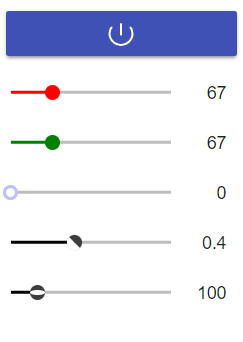
The focus feature reminds me of OneNote’s Immersive Reader, which has a similar feature. You can see Visor’s in action below, focusing the reader on a line of content:
As you can see, a line of content appears in normal colors while the rest of the visible screen is dimmed. You can see OneNote’s Immersive Reader, which works just fine in the Chrome browser with content in a OneNote notebook, below:
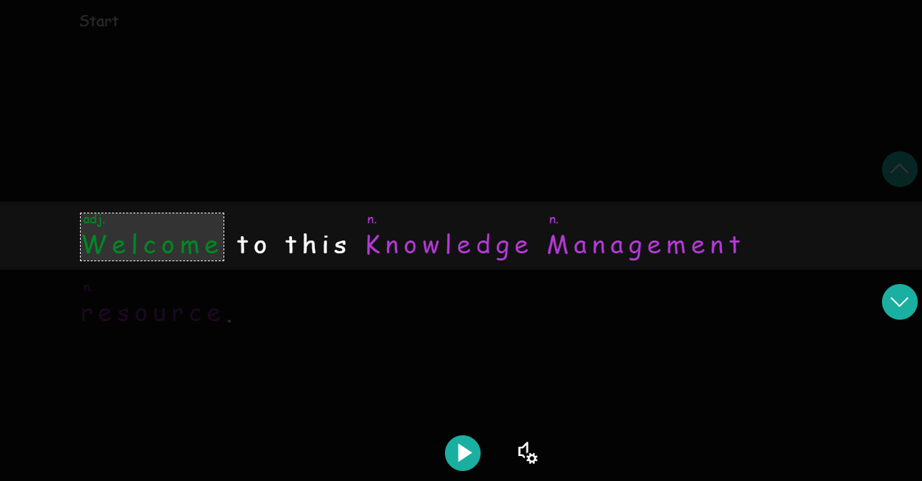
The only reason I share OneNote’s Immersive Reader is that it is the gold standard for accessibility right now. Watch this video to learn more.Read this blog entry for updates announced January, 2019.
Option #3 – Eye Protection
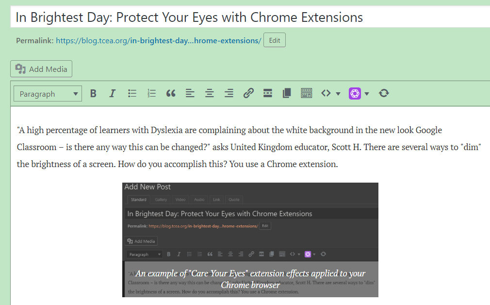
Boasting similar features as Care Your Eyes and Visor, Eye Protection makes it a simple affair to replace the white background that leads to blur effect. You can see the options available via its Chrome extension drop-down:

And this is what a web page looks like. The light green color fills the white space of the background.
Option #4 – High Contrast
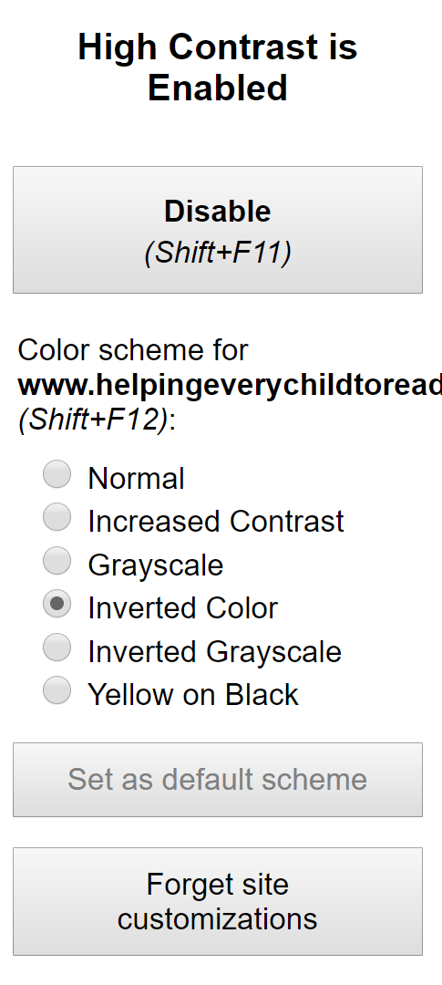
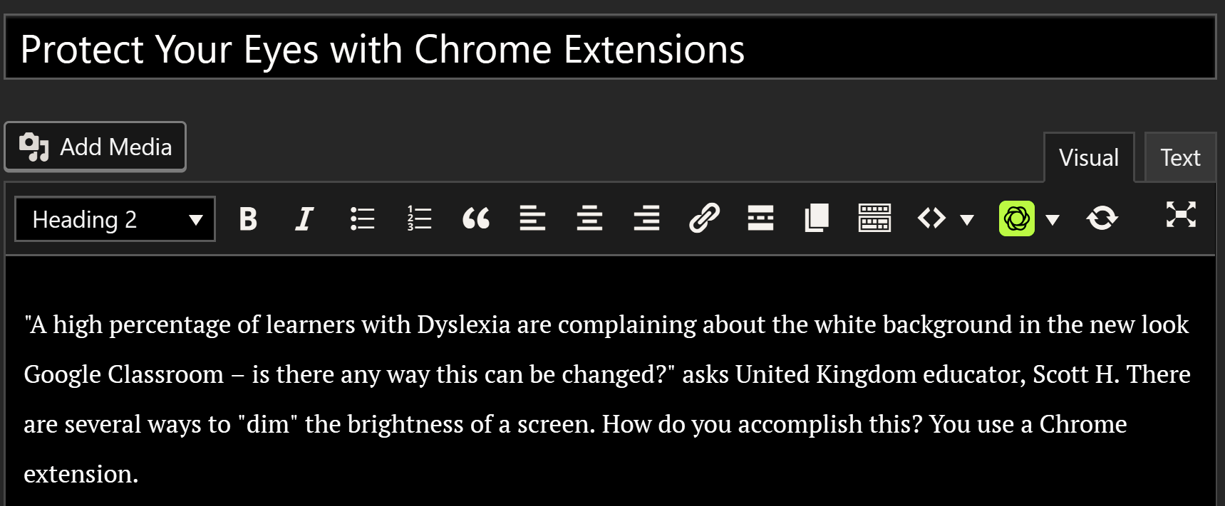
Like the other solutions, the High Contrast Chrome extension makes it a simple matter to “invert the color scheme to make web pages easier to read.” All that is black becomes white, and white becomes black. Only photos are not inverted. You can see the options available:
Here’s what a web page looks like with High Contrast enabled:
Protect Your Eyes with Chrome Extensions
You don’t have to be dyslexic to seek to minimize brightness and improve readability on websites. These Chrome extensions should provide you with some options.


 leaderboard became a cheerleader for us. It fueled the flame of reading.