It’s not for nothing that Google Sites is my preferred presentation tool. It’s so easy to arrange content, to drop content in with copy and paste. But have you seen some of the latest changes? Let’s take a look.
Two New Google Sites Page Options
If you work with Google Sites enough, you’ll realize that you can move pages around with ease. You can group them one under another to avoid the overwhelm of a long list of pages, but sometimes, you would have to create a blank page to mark the sections for organization. Now, as an improvement, Google Sites added a “New menu section” to their list of options. Recently, they also added a “Full page embed” feature that wasn’t there a short time ago, and this feature gives several options for embedding different file types on a page.
1. New Menu Section
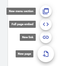
The “New menu section” works as a placeholder, making it easy to move pages underneath it, and it doesn’t result in an empty page to mark the section.
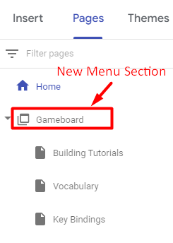
In the screen capture shown above, you can see that “Gameboard” displays a different icon than a page. Instead, it is an icon of overlapping boxes that signals a menu section. You can add subpages as well as hide them from navigation. A search of the site does reveal hidden pages, though.
2. Full Page Embed
This second option on the “New page” menu, makes it easy to embed a file, map, video, and more onto a page on a Google Site. When you hover over the “New page” icon and select the “Full page embed” option, you will be prompted to title your page. Once the page is created, you will see the option to “Add embed” or “Add from Drive.”
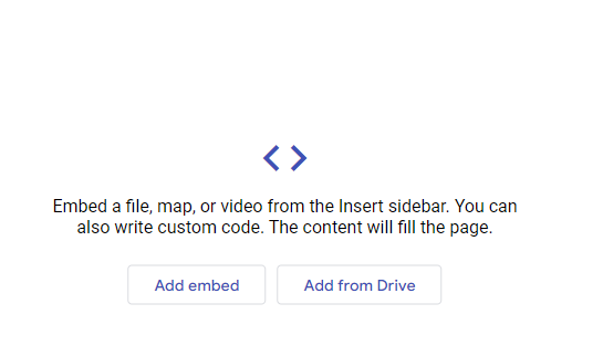
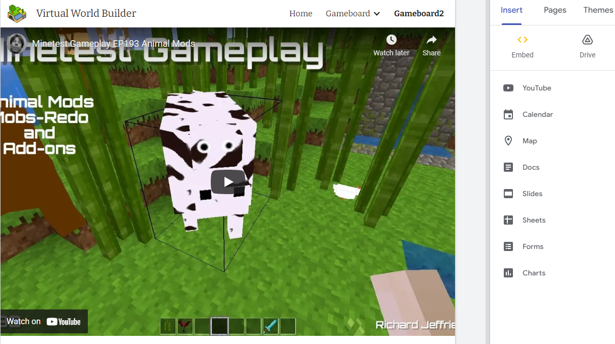
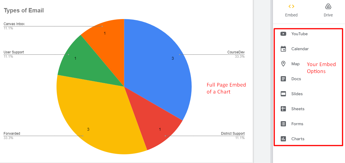
As indicated, the content fills the page once embedded. You can see an example below of an embedded YouTube video and a chart. In the menu to the right of the page, you can see that you have several options for what you can embed, but you can only embed one item per page. Still, this makes for a powerful embed option.
New Google Sites Create a Theme Feature
This is a change I only wish I knew how to use better. If you’ve ever despaired of Google Sites’ pre-supplied themes, you now have options. When I work with Google Sites, I can never find the right combination of colors. Color matching isn’t my thing. But for some of you reading this, you will find delight in what Google now gives you control over.
Launch the Create a Theme wizard, which appears under Themes, and you get options. You can tap on the plus symbol to create a theme or import a theme. I have not yet seen the theme export option.
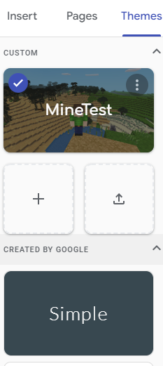
Let’s look at Create a Theme up close below.
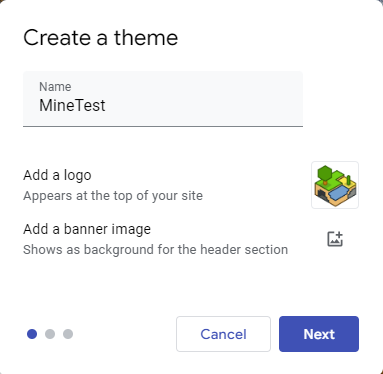
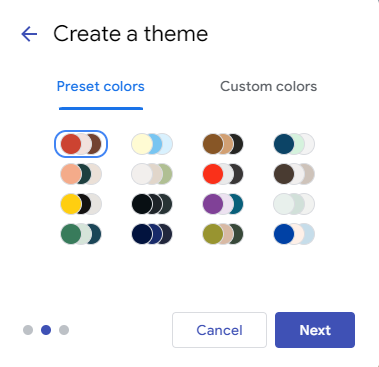
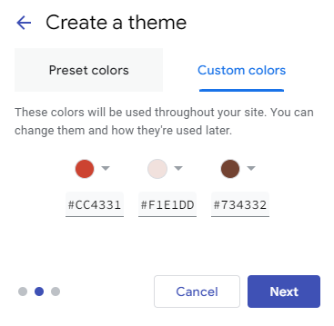
You can now create themes, add a logo, and a banner image. Additionally, you can adjust the preset colors or set custom colors.
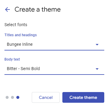
Google doesn’t stop with color. It also allows you to select your default font for titles, headings, and body text.
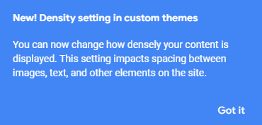
Google Sites’ new “Density setting” in custom themes lets you determine how content appears. It reminds me of Gmail’s setting that determines how compact you want emails to appear. The new setting in Sites describes itself in this way:
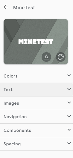
Once you have made your choices, you will find all your custom theme options in one place. You can make adjustments to your previous decisions, tweaking them for hours on end if you so choose.
Change Is Inevitable
As the saying goes, “Small changes add up to huge results,” and it’s true in this case. You may not realize it yet, but Google Sites has made big improvements to how it works and empowers users. Now the question is, “How can I transition blank pages to new menu sections without breaking links?” Check back with me. I’ll let you know, ok?
Feature Image Source
Screenshot by author.

