
Infographics tell stories, but they can do so much more. In this blog post, you will see how you can deconstruct infographics into their data components, then reconstitute it in new AI-powered visuals. Using the steps below, you can create something new that’s interactive.
It’s so easy, students could do it, so long as they’re allowed to use AI, and you can, too! You don’t even need to know how to code. This method works for any history or infographic where you have numbers in a picture. Let’s get started.
Note: All images in this blog entry generated by author. Photos featured in slide deck are in public domain. This blog entry was inspired by this video.
Get To Know the Vocabulary
In this article, you will likely run across some vocabulary words you may not have encountered before. The goal is to use AI tools (e.g. Claude, ChatGPT, Perplexity) to generate code and diagrams, but if you don’t know the vocabulary, you may be unable to direct the AI. That’s why these words matter. They’re a special language spoken by the AI that will enable you to ask for what you want, specifically.
| Term | Definition |
|---|---|
| JS-based Presentation | A slideshow-like display created using JavaScript, allowing for interactive elements in a web browser. |
| JSON | A simple text format for storing and transporting data, often used in web applications. |
| Mermaid | A tool for creating diagrams and charts using text and code, similar to markdown for visual elements. |
| Plotly.js | A JavaScript library for creating interactive and customizable graphs and charts on web pages. |
Making an Infographic
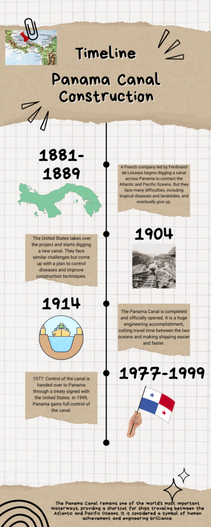
Making timeline infographics with artificial intelligence (AI) is drop-dead easy. Start with an infographic of the Panama Canal, displaying dates and facts. You can use a prompt like the one below to match historical dates and events:
Prompt: Come up with a timeline showing key events in the construction of the Panama Canal. Include relevant years or date ranges, key events or milestones, brief descriptions of challenges faced, or achievements made.
Then, you can easily make a timeline in a tool like Canva (see example). But how do you turn an existing infographic into data that you can work with? AI can help! Let’s follow these simple steps.
Did you know you can use Canva for Education's free online infographic maker? Find it online. They offer a video walkthrough their amazing templates and resources.Step 1: Create an infographic.
To convert an infographic into data, start by providing the AI with an infographic. Here’s one I made on the construction of the Panama Canal.
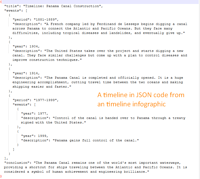
Step 2: Convert the infographic into JSON data.
Now, convert that infographic into a JSON dataset. To do that, use the following prompt:
Create a JSON of the data in the attached infographic.
This will give you a result that looks like this:
At this point, you can create several different diagrams or outputs.
Step 3: Generate the desired output.
Now that you have your infographic’s data in JSON format, you can turn it into any of the following:
- an interactive timeline using Plotly.js
- a diagram or chart with Mermaid
- a web-based (HTML) presentation you can share.
Let’s take a look at some examples of these outputs:
Interactive Timeline
To get an interactive timeline, use Plotly.js prompt below:
Create a plotly.js interactive graph. Make it vertical.
This generates a graph like the one shown below:
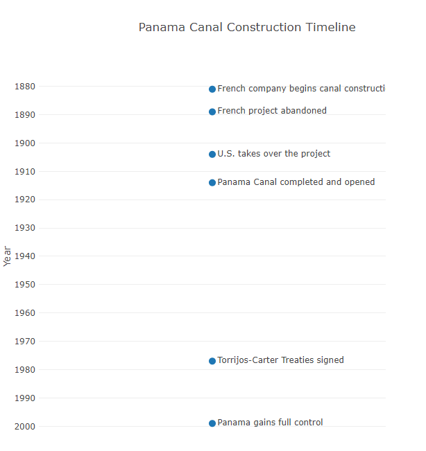
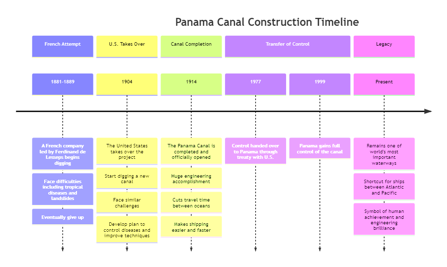
Diagram or Chart with Mermaid
You may recall this blog entry, Flowcharts and Mermaid Code, that walks you through the basics of creating charts. AI chatbots like Claude, ChatGPT, and Perplexity can take your data and put it into Mermaid code. You can then use a free editor (see the linked blog entry) to convert that code into a diagram. Some chatbots, like Claude, can generate the diagrams.
Create a top-down Mermaid chart of the timeline data.
With a simple prompt like the one above, you get an overview of the key phases in the Panama Canal’s history.
This timeline can make understanding infographics easier for middle and high school students. Not only can they visualize the data, but they can also interact with it.
Web-based Presentation
Another way to represent the JSON data of the timeline is to have the AI create a javascript-based (JS-based) presentation. This presentation (see example below) is easy to share and is not dependent on Google (e.g. Slides), Microsoft (e.g. PPTx), or OpenDocuments formats (e.g. ODP). Instead, your end result is a single webpage out of HTML. Students can easily modify the code in a text editor.

The prompt to convert your timeline data in JSON format to a browser friendly presentation is simple:
Make a JS-based presentation from the data. Include image placeholders on each slide.
The resulting HTML code can be edited or modified. Students can add authentic photographs or images to the HTML. That’s the most I would have fifth through eighth grade students do, although it’s quite possible some would be able to complete more.
Visualizing the Data
For older students, particularly those in high school or college, incorporating data visualization can add depth to their understanding. Here’s a sample chart reflecting workforce growth during U.S. construction of the Panama Canal:
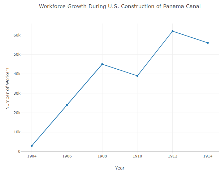
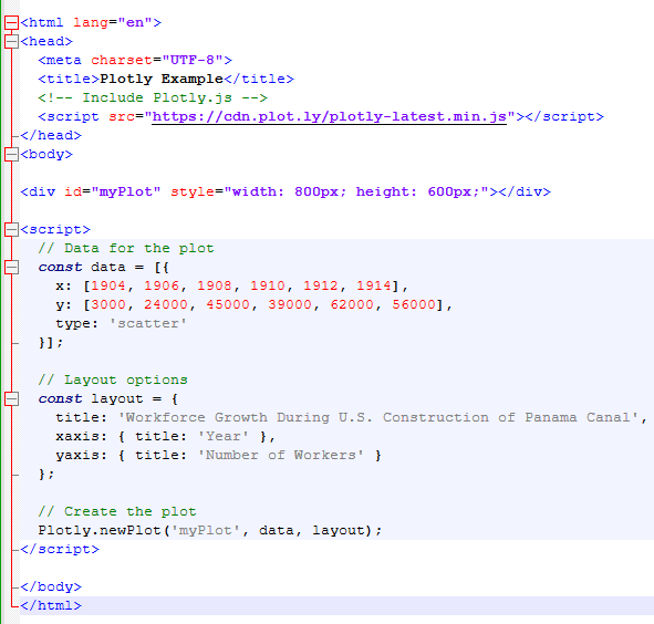
This is based on the code that can be displayed on a webpage:
This code would create a line graph showing the growth of the workforce over time. This kind of visualization assists students in grasping the scale of the construction project.
Understanding the vocabulary of what an AI chatbot can produce extends what you can create with the data you bring to the table. If a teacher is analyzing aggregate student data (no personal information shared), then they can more easily generate graphs and diagrams. I can also put that data in presentation format that is easy to share.
The Power of Deconstructing Infographics with AI
Using existing infographics available on the web, students can learn how this data fits together and informs the visuals they see online every day. It empowers them to use the AI as a partner in understanding the information around them. A simple timeline might be perfect for younger learner, while a coding project to create an interactive chart could engage older learners. Students of all ages are capable of using AI-powered coding and tools to transform pictures into data, then make new visual creations.
More Examples
Take a look at this video that features a few infographic deconstructions using AI. It highlights that, while this process can be successful, it might not always work. Keep exploring new approaches to find new and exciting ways to create data plots and instruct your students!