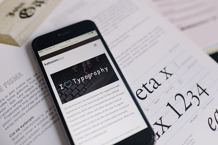
Comic Sans is a controversial typeface. You may recognize the hand drawn-looking letters, perhaps you’ve even used them. In fact, the font is commonly used by teachers. But it’s also been lambasted, mocked, and outright hated. So what makes this common font so interesting — and what might you not know about these buzzed-about bubble letters?
A Font of Creativity
Comic Sans was designed by Vincent Connare in 1994 while he was a typographic engineer at Microsoft. The font was packaged with Microsoft programs and operating systems. Connare felt the typeface used in developing the early Microsoft Bob system, Times New Roman, was a little too boring, and wanted something friendlier, making the user interface more approachable to students and people not used to working on computers.
Connare was a fan of the graphic novel, and was inspired by the speech bubbles to create something simple and rounded, letters that might have been created by cutting with blunt scissors (the truth is he used a popular font-making software package).
“What’s so wrong with Comic Sans?” BBC
Though it didn’t fit into the grids of early Microsoft systems, it eventually found its way into Microsoft Movie Maker and Windows 95. From there, its popularity — and infamy — grew.

Comics Sans in Education and Beyond
From the beginning, Comic Sans, inspired by comic books, was designed to be used for children. “My original idea was it was going to be used for kids. It wasn’t made for everybody to like it,” Connare told LiveScience in 2019.
Connare himself believes the typeface was quickly adopted in the 1990s because people were, for the first time, able to pick what their documents looked like, and gravitated to fun and unique fonts, as they “were picking crazy things because they could do anything.” Teachers began using computers and printouts heavily in the 1990s, and it’s little surprise that educators, armed with new PCs that allowed them to make their own handouts, chose to use the playful, childlike look of Comic Sans.
When people ask him at dinner parties what he does, he tells them he designs type. ‘You might have heard of Comic Sans,’ he suggests. And everybody says yes.
“What’s so wrong with Comic Sans?” BBC
But popularity often comes with a backlash. Perceived as a silly or unserious font, its ubiquity quickly became the source of ridicule, especially when used in somber circumstances like memorials and letters.
Defenders have come to the font’s aid over the years, even launching a “Comic Sans Day” on the first Friday of July. In 2017, Connare summed up the polarizing effect of the font, one he admitted to The Guardian that he’s only used once.
“The basic theory is that typography should not shout — but Comic Sans shouts,” he said.
Potential Hidden Benefits
While Comic Sans is an obvious choice for young learners, recent arguments suggest that it might also have hidden benefits. The wide-set, uniquely-shaped letters may assist dyslexic people in reading. According to the British Dyslexia Association, “sans serif fonts, such as Arial and Comic Sans,” are best for dyslexic workers. In 2016, AIGA, an association of designers, claimed that Comic Sans “might just be the best font for people with dyslexia.”
Further, Comic Sans may be useful for the youngest learners, as it’s one of few fonts that style the lowercase letter “a” in the manner that most people write it.
The evidence of Comic Sans effectiveness, however, is scant, mostly because very little research has been done, and what has been done may depend on the expertise or research focus of the researcher (think design expert versus a language expert). In 2018, Jon Severs, editor for the educational company Tes put it this way:
Comic Sans use should not be justified by claims of increased readability or benefits to dyslexic students or indeed for handwriting, but if you just like it, and your pupils like it, there is no good reason you should not use it.
“Does Comic Sans help dyslexic learners?” Jon Severs, Tes blog
For those looking for typeface custom-made for dyslexic learners, check out Dyslexie and Open Dyslexic.
Photo via PickPik

