

Our students are hooked by high-quality and engaging digital content daily. But how can we, as educators, harness the power of good design when creating activities and resources for our classrooms? Let’s explore ten graphic design tips that will boost any busy educator’s abilities when it comes to classroom content creation!
1. Design with the end in mind.
Just as we begin with the end in mind when planning a unit, strive to do the same when designing classroom graphics and materials. Before diving in, consider a few questions:
- Who is your audience? This question forces you to consider font and colors. A script font, for example, is not ideal for elementary students unable to read cursive.
- What are the standards and the purpose of this activity? Your content impacts your theme and color selections (i.e., spring-themed pastels probably aren’t fitting for a presentation discussing the Civil War). Always align your design with the lesson’s objectives.
- Will your resource be printed or completed on a device? This impacts your canvas size. Assignments completed on a screen may be better suited in landscape format, but start with an 8.5 x 11-inch canvas for printed activities.
When we start our designs with a clear end goal, our artistic choices serve our academic objectives.
2. Make your designs readable.
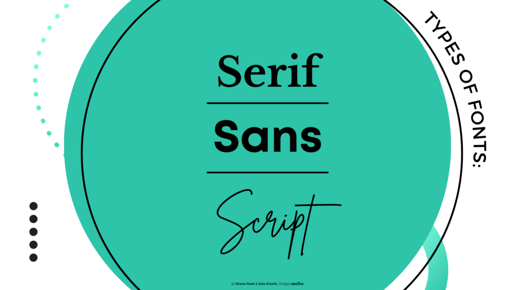
Consider Canva’s font pairing suggestions and stay consistent as you create activities. When building resources, limit yourself to three fonts, using one for headings, another for subheadings or callouts, and a legible sans serif for the body. Generally speaking, there are three font types: serif, sans serif, and script.
- Serif fonts, like Times New Roman, have small strokes and give a traditional, refined vibe. They’re an excellent choice for print materials because the strokes enable our eyes to follow the lines as we read.
- Sans serif, translated as “without serifs,” are fonts like Arial or Calibri. These have become increasingly popular in the digital age because they are legible on screens; therefore, nearly all websites and apps use some variation of sans as the primary text.
- Script fonts, which may be described as cursive or handwritten, are growing in popularity in the design world and in our schools. But most students are unable to write or read cursive handwriting, so use these with discretion.
- Explore OpenDyslexic and Lexend. While research is tenuous, some studies suggest these fonts are excellent for reducing visual stress and serving readers with visual impairments and dyslexia.
As a final suggestion, always prioritize content over cuteness. It does not matter if you feel a typeface is cute if your students are unable to read the content.
3. Be intentional with color.
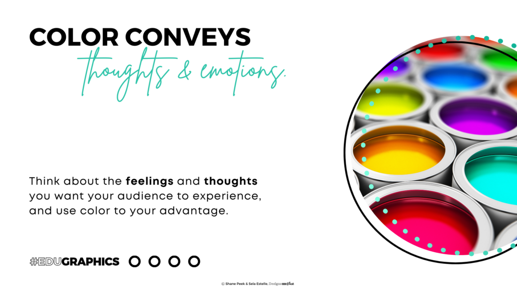
What do you think about when you see the color red? Perhaps that depends on the time of the year, current mood, favorite team, or your feelings about Taylor Swift (and T. Kelce). Suffice it to say, colors convey thoughts and emotions, making them an important element in design. While color theory is an intriguing, vast field, the key is to intentionally select colors that serve your content (i.e., greens when exploring photosynthesis). When in doubt, be consistent. Unless you’re exploring the electromagnetic spectrum, stick to three dominant colors that are complementary. Check out Coolors or Canva’s dashboard for help with building a palette.
4. Use visual hierarchy.
What do you notice when you look at a poster? Our brains are programmed to first take in the image or moving object (video/GIF). After that, we scan to find the biggest font, and if interest dictates, we move on to the fine print. What if educators used this visual hierarchy to our advantage? When creating resources, remember students are drawn to the image first, followed by the largest font. What really needs to be communicated? Is that animated GIF a distraction? Is your most important content in fine print? If something is important, communicate it boldly and avoid the fine print in your designs.
5. Contrast is key!
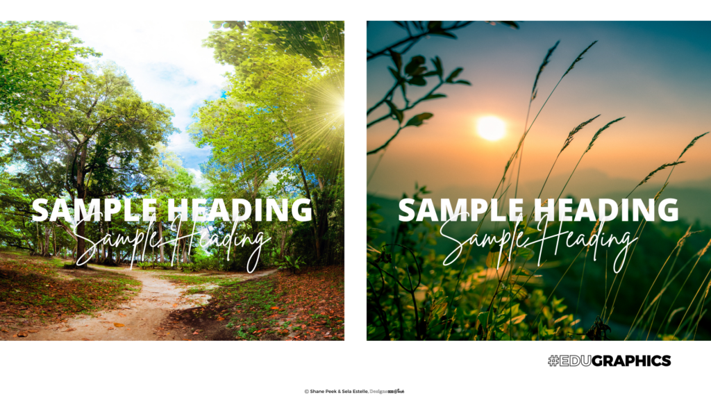
Leverage the visual hierarchy to your advantage and draw the reader’s eye to important information by using contrast. When layering text on an image or a colored background, ensure students can read the text by pairing dark backgrounds with light fonts. If your image is light and bright, use a darker font. Shadow effects are another trick for enhancing contrast and boosting legibility. Avoid choosing backgrounds that have a lot of visual contrast with many light and dark elements within the same image.
6. Use the Rule of Thirds.
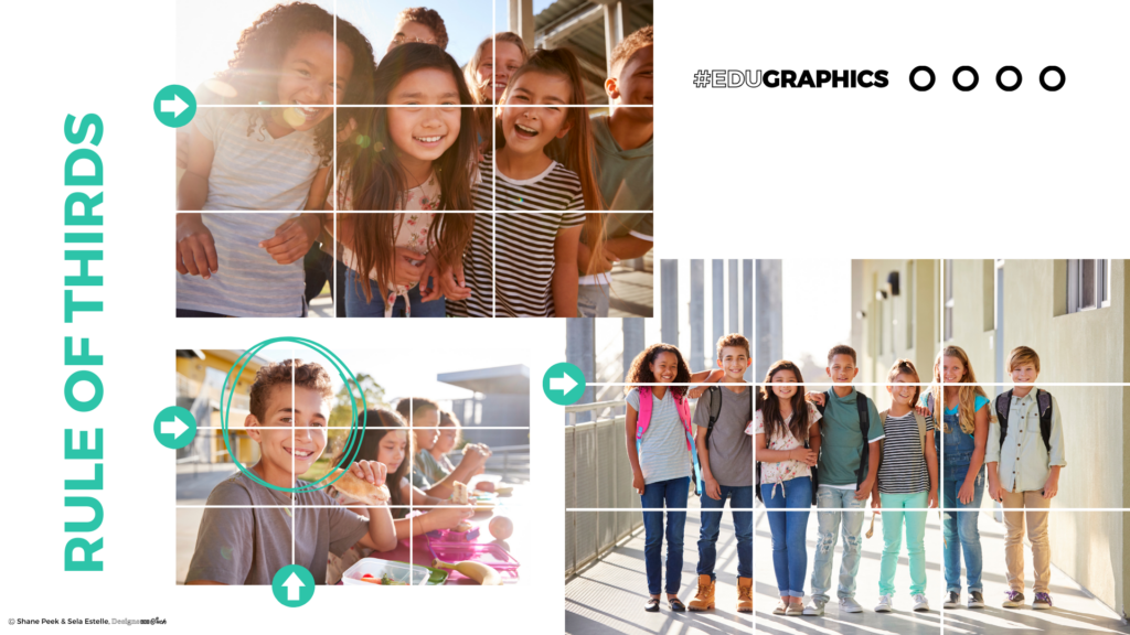
There’s an age-old principle in photography called the Rule of Thirds. Essentially, if you take your newsletter, slide, or handout and divide it into nine equal parts with three rows and three columns, the design has a balanced composition with focal points. As a fellow educator, I recommend communicating the most important detail or positioning critical objects in images on one of these focal points if you really want the content to stick.
7. Crop, never stretch.
Can I pull out my soap box for a moment? I see too many images that have been stretched from the side, leading to a distorted image with extra-wide (or tall) objects. Instead of stretching an image that doesn’t fit into a desired area, scale it from the corner. Then, crop it to the appropriate size. This maintains the natural size and proportion of the objects in the image and ensures there is no distortion.
8. Be aware of invisible lines in your designs.
Whether you realize it or not, invisible lines exist in your presentation or handout. Does the top of the heading align with the top of the image? Is there enough spacing between the edge and the text? Does the space between each textbox match? These invisible lines and spaces are ever-present and critical in design, and when neglected, your layout seems disrupted, and your eyes feel tense. Paying attention to the invisible lines and respecting their importance can take your design to the next level.
9. Less is more!
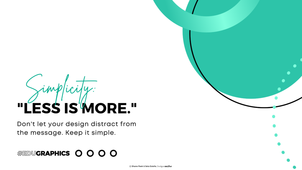
Every hallway has one. That teacher who has every inch of wall space covered, and their slideshows follow suit. You know who I’m talking about! While their intentions are good, it’s important to remember that more does not equal better. When creating content for students, resist the temptation to overcomplicate your designs with excessive decorations, animations, or fluff. Leave space for your students’ eyes to breathe. This simplicity not only enhances overall design but ensures accessibility for students with sensory and visual impairments.
10. Refresh the retina.
Have you ever opted to “push through” and continue working on a project even though you’re not making progress? Grit is a quality to praise (thanks, Mrs. Duckworth), but I’ve noticed a trend in my work. I can push through, continue working for 20 minutes, and possibly see a 2% increase in quality. Or, I can take a brief break and return refreshed, usually yielding a drastic increase in quality in mere minutes. When time permits, don’t be afraid to step away from your design and return later with fresh eyes. Your work will show significant improvement.
We’ve covered a lot of territory, but if I could leave you with one suggestion it would be this: Choose one strategy outlined above and dig deeper. Did one specific tip resonate with you? Start there! And then add more as you go. Which tip will you start using today?
Interested in learning more about designing classroom content? Come to Shane Peek’s sessions at TCEA 2024!
- Canva 101: A Guide to Creating Compelling Designs with Ease
- Maximizing Your Time with Canva: 12 Tips for Busy Teachers
- Canva for the Busy Administrator
Hundreds of other educators, like Shane, will be leading professional learning sessions on top topics like design, AI, literacy, instructional strategies, ed tech, research, and more. Don’t miss the education conference that brings in thousands of educators from all over the world every single year!
2 comments
Great tips and article. Thanks for the share.
Brandingcolors.net is also a great source for finding complementary color palettes.
This is super helpful! Thanks for sharing these graphic design insights.